
Depending on what data point we are looking at, U.S. inventory ranges from inflated to balanced.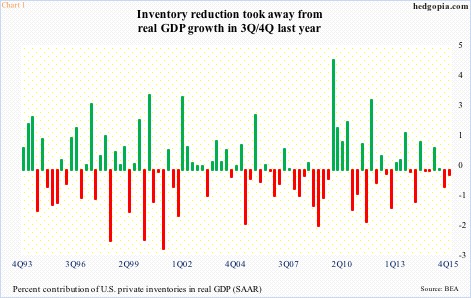 In the third and fourth quarters last year, inventory reduction took away 0.71 percent and 0.22 percent from real GDP growth, respectively (Chart 1). Real GDP grew at a seasonally adjusted annual rate of two percent and 1.4 percent in those two quarters, in that order. That said, private inventories’ contribution in real GDP in the first half last year was much bigger, so the second half simply unwound the first-half excess.
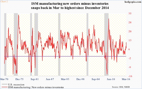 This is also reflected in ISM manufacturing and non-manufacturing inventory indices. Manufacturing inventories shrunk from 53 in June last year to 43 in November, before rising to 47 by March. Similarly, between July and September last year, services inventories dropped from 57 to 51, with March at 52.5.
Chart 2 uses both manufacturing orders and inventories to calculate a spread between the two. In September last year, this dipped to as low as 1.3, but jumped to 11.3 by March. The latter surge was due mainly to a 6.8-point, month-over-month spike in orders, even as inventories only rose two points to 47. Manufacturing inventory in particular has been sub-50 the past nine months – kind of subdued.
Then we have this. In manufactured goods, orders and shipments are dropping much faster than inventories – not an ideal scenario to be in.
In February, new orders dropped three percent year-over-year to a seasonally adjusted annual rate of $454 billion. Similarly, inventory fell 2.3 percent to $634.3 billion, and shipments declined 3.5 percent to $462.8 billion.
Both new orders and shipments peaked in July 2014 at $565.2 billion and $508.7 billion, respectively. Inventory peaked in November that year at $656.1 billion. So from these peaks through February, shipments are down nine percent, new orders down 19.7 percent, and inventory down 3.3 percent.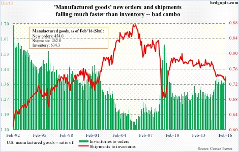 Therein lies the imbalance – inventory down only slightly, and orders down more than shipments. This is reflected in Chart 3. The inventories-to-orders ratio in February rose to 1.4 (same as in December last year), matching the August 2009 reading. Similarly, the shipments-to-inventories ratio of 0.729 in December last year (February was 0.73) was the lowest since 0.721 in July 2009.
Chart 4, too, portrays a dire picture of surging inventories. In it, U.S. banks’ commercial & industrial loans are pitted against the inventories-to-sales ratio in manufacturing and trade.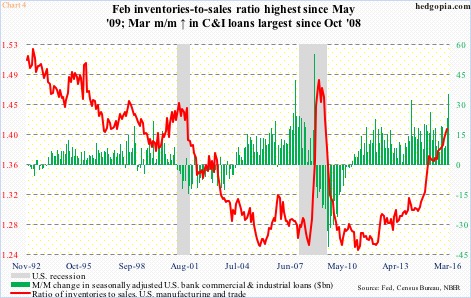 In February, inventories were $1.81 trillion and sales $1.28 trillion, for a ratio of 1.41, which was the highest since 1.43 in May 2009. The parabolic spike in the red line in Chart 4 is in particular noticeable. Also noticeable is the rise in C&I loans.
In March, these loans jumped by $35.3 billion month-over-month to $2.02 trillion. The March spike was the largest since October 2008. Makes you wonder how much of these loans are going toward inventory buildup.
The bottom line: U.S. inventory looks balanced on some metrics, but in the aggregate remains elevated. Charts 3 and 4 speak volumes.
Thanks for reading!
