
- Wall Street is full of maxims such as “As goes January, so goes the year”
- Not prudent to be solely basing one’s investing decisions on adages
- An up January substantially raises odds of year ending in green
“As goes January, so goes the year.” Around this time every year, we are told to watch how January behaves. How stocks act in the first month sets the tone for the year is a very well-accepted notion. But is it really this simple?
First of all, Wall Street is full of such clichés.
November-January are supposed to be the best three months. We have all heard of Sell in May, and go away. And of course the Santa Claus rally. There is this first-five-day rule in January. According to the decennial cycle, 2015 is supposed to be a very good year for stocks.
Then there is the presidential cycle, which says the third year’s returns are the strongest, which happens to be this year. The second year, which was 2014, on average is the weakest of the four, but still managed to rally 11 percent last year. By the way, going by the presidential cycle, year one, two, three and four are all expected to be up years. It is just a matter of some up more and some less. There is never a down year. Makes sense?
Not really.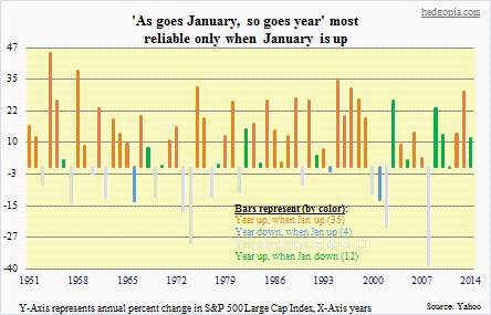
Going all the way back to 1951, as shown in the chart above, the S&P 500 Large Cap Index had 48 up years and 16 down years. One fourth of the time, the index was down.
With this as a backdrop, let us see if the ‘As goes January, so goes the year’ narrative verifies.
First of all, it is probably not prudent to pooh-pooh these buzzwords/maxims out and out. It helps to stay abreast of these. The key is not to solely base one’s investment decisions on what they preach. Sometimes they work, sometimes they don’t.
The chart above can get confusing at first glance—may even look jumbled—but after a few minutes, it will begin to make sense.
There are 64 bars, each representing annual change in the S&P 500 beginning 1951. The X-Axis plots the years, and the Y-Axis the percent change in the S&P 500.
The data is divided into four subsets, namely (1) years that were up when January was up, (2) years that were down when January was up, (3) years that were down when January was down, and (4) years that were up, when January was down. Each bar represents one of the four and is color-coded differently.
What jump out immediately are the orange bars. More on that later.
Of the 64 bars (or years), we have 39 in which January was up, and 25 in which January was down. So 61 percent of the time January was up.
But does that tell us anything as to which way a year is going to go?
Of the 25 years in which January starts out in the red, it is a coin toss. Really. Twelve out of the 25, a year starts out with a down January, nonetheless manages to end in the green. These are the green bars in the chart. The remaining 13 times, a down January results in a down year (grey bars). There is no signal here. 50/50 odds. It is as good as throwing darts.
Now on to the interesting part. The orange bars reveal a lot.
First of all, of the 39 years in which January was up, only four were down (blue bars). Yep, only four. The remaining 35 were up—that is 90 percent. Statistically very significant. So once January is up, the odds of that momentum continuing through the year rises substantially.
The takeaway here is this. It does not matter if January is up or down. There is essentially no signal. Once again, we had a down January last year, but the year turned out just fine. What really matters is if January is positive. If it is, then the odds of that year ending in the green rises substantially.
Can you hear me? That is January asking the bulls. Let us see if the latter can deliver, even though the month has not gotten off to a good start.
