
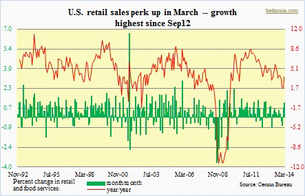
 There was a lot of excitement early this week after U.S. retail-sales data were released. At 1.14 percent, month/month change in retail and food services was the highest since September 2012. ‘Motor vehicles & parts dealers’ helped a great deal – up over three percent m/m. This category comprises nearly one-fifth of total sales, so its contribution – or a lack thereof – can make or mar any given month. But even when we exclude the category, retail sales still expanded 0.7 percent m/m – highest since February 2013. This was more than enough to make up for monthly drop in categories such as ‘gasoline stations’ and ‘electronics and appliance stores’.
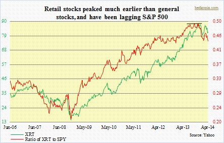 Optimists latched on to this data point as one more proof of how the harsh winter weather played tricks with the economy early this year, and how things are now falling back in line. It will be a while before we really find out if weather was the only culprit or there was something else in motion. What we do know is that retail stocks in general have not been acting well. And it has been a while. The XRT index peaked late November (2013), versus early-April high for S&P 500.
All retail stocks are not born equal. This is particularly so in the current cycle as QE has resulted in higher stock prices, but job creation remains weak, coupled with weak wage growth; average real hourly earnings, as a matter of fact, are down versus late-2008/early-2009. This fact is reflected in stocks. There is a clear difference in performance between haves and haves-not. Just look at the charts for luxury retailers like JWN and LVMUY. They act very well. KORS, too. On the other end of the spectrum are DLTR, DG, FDO, etc. Among mid-tier department stores, M is doing just fine. JCP and SHLD, on other hand, act poorly.
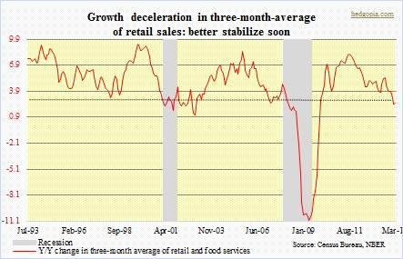 Overall, though, the retail sector has been lagging the broader index. In the current cycle, this is not the first time this has happened, but the intensity this time around is sharper. Last year, the ratio made three successive peaks (above). In this context, the chart on the left is perhaps trying to tell us something. It is too soon to reach a conclusion, but it is worth keeping an eye on. This data series goes back only 1992, so we can only refer to two recessions. To smooth out monthly volatility, I have taken an average of three months to calculate year/year comparison. Interestingly once y/y growth decelerates to three percent – or thereabouts – a recession has followed. March growth was 2.5 percent. Having said that, there was a false signal in December 2002. It is just one data point. Several others are not sending out the same signal. Nevertheless, it is definitely something worth keeping on the back of one’s mind.
