
U.S. corporate bond issuance continues at a healthy pace, with high-yield in particular on course for growth this year after three consecutive yearly decline.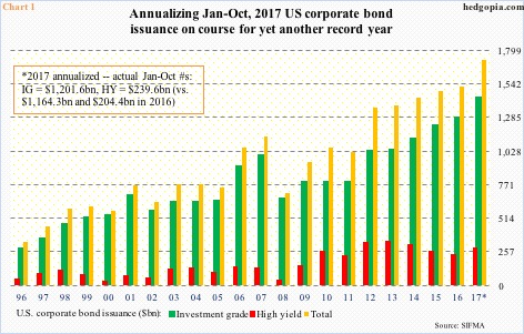
In October, corporate debt issuance totaled $140.9 billion, consisting of $118.2 billion in investment-grade and $22.7 billion in high-yield.
This brings January-October total to $1.44 trillion, up 5.3 percent from the corresponding period last year. Of this, investment-grade was up 3.2 percent to $1.2 trillion and high-yield up 17.2 percent to $239.6 billion.
Annualizing the first 10 months this year, issuance is on course for $1.73 trillion (Chart 1). Of course, this assumes the 10-month momentum continues in the last two. Last year, November and December only issued $158.2 billion. Even if we assume issuance in November-December this year sees no growth, we are still looking at $1.6 trillion, up 4.5 percent from $1.53 trillion in 2016.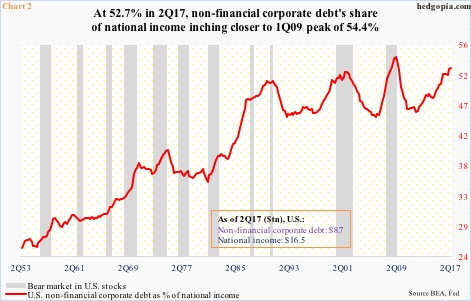
Whether it is $1.6 trillion or $1.7 trillion, 2017 is all set to notch yet another record, and will represent eight straight years of trillion-dollar-plus issuance. In fact, between 2010 and 2016, issuance totaled $9.27 trillion.
Corporations are taking advantage of the prevailing low rates, and are also extending maturity. The average maturity went from 11.8 years in 2009 to 17 in 2015, with 2016 at 15.8.
It is hard to quantify, but a decent portion of this probably went toward stock buybacks and dividend payments. The question, of course, is of sustainability. If the proposed tax-cut/reform measures get rid of interest-rate deductibility, then suddenly debt issuance becomes less attractive.
Then we have the issue of sheer size of it. Do corporations have taken on too much debt? Chart 2 tries to answer that by calculating non-financial corporate debt as a percent of national income, which shows that things are elevated. By the way, this is just one way of looking at things, other metrics may not look as egregious.
In 2Q17, non-financial corporate debt amounted to 52.8 percent of national income – higher than the 52.2 percent peak of 4Q01 and inching closer to the all-time high of 54.4 percent in 1Q09.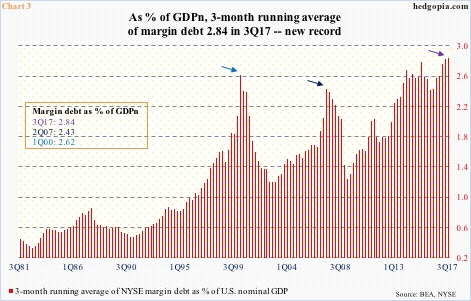
If it turns out the red line in Chart 2 rose to a new high in 3Q17, or does so in the current quarter, what does that mean? For investment purposes, can this be treated as a signal? Not quite. In the last three bear markets, and several others in the past, it turned lower well into stocks had slid into a bear.
Speaking of credit, Chart 2 is similar to Chart 3 from this standpoint. In it, a three-month running average of NYSE margin debt is used to calculate its share of nominal GDP.
In September, margin debt rose $8.8 billion month-over-month to $559.6 billion – a new record. It is up $70.1 billion this year. In 3Q17, the three-month running average was $553.5 billion, and nominal GDP $19.5 trillion. The resultant 2.84 percent is a new high – higher than the prior peaks of 1Q00 and 2Q07, both of which preceded bear markets.
Once again, yes the metric is at a nosebleed level, but in and of itself, as a signal this is not much help. What it does – or should do – is this. This is telling us this is not the time to be throwing caution to the wind. The bars in Chart 3 are so lofty when they turn they can do so abruptly. Ditto with Chart 2.
Thanks for reading!
