The price to sales ratio is an important valuation tool that many investors swear by.
The market cap to GDP ratio – essentially a ratio of price to sales – supposedly is a favorite indicator of Warren Buffet.
On this basis, it is currently flashing yellow at best and red at worst.
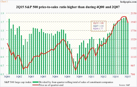
In Chart 1, the green bars represent a price to sales ratio using the S&P 500 index and a rolling four-quarter sales of its constituent companies. In the second quarter, the ratio was 1.8. This is higher than during both 2000 and 2007 peaks.
As a matter of fact, if we use yesterday’s price of 2078.58 on the S&P 500, the ratio rises further to 1.83. But a quarter-end price is shown in the chart, and on that basis the ratio dipped to 1.69 in 3Q15. Either way, the ratio is highly elevated – something value investors in particular probably give a lot of thought to before putting new money to work at this juncture.
And this can have other repercussions.
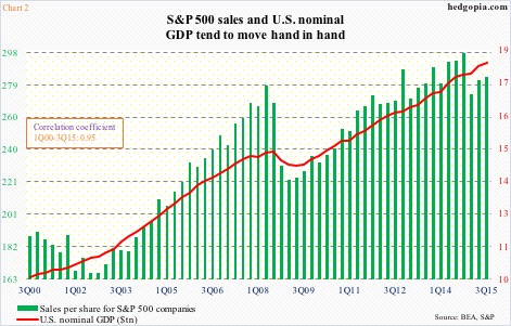
As Chart 2 shows, S&P 500 sales and U.S. nominal GDP tend to have a tight correlation. Yes, these companies draw nearly half of their sales from overseas, but the other half is generated here – the largest economy in the world. U.S. nominal GDP in the third quarter was $18 trillion. From this perspective, it makes sense for the two variables to correlate tightly.
At the beginning of the year, real GDP was expected to grow north of three percent in the U.S. The consensus has consistently been revised downward – now at 2.3 percent. Last year, real GDP grew 2.4 percent. The average growth post-Great Recession has been a mere 2.2 percent, versus an average of 3.2 percent going back all the way to 2Q47.
The point is, despite all the monetary stimulus the Fed has thrown at the system, GDP is stuck in the rut. The existing debt load is proving to be a big inhibiting factor. Using this logic, S&P sales are unlikely to accelerate anytime soon. With more than 87 percent having reported their September quarter (as of November 5th), less than half are beating on the top line.
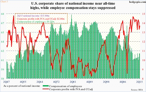
This can potentially impact margins. One of the highlights in the current cycle has been the rapid increase in U.S. corporate margins. In Chart 3, the green line plots the share of corporate profits in national income, and the green bars that of employees. The former is winning hands down.
The red line in Chart 3 peaked at 14.5 percent in 1Q12, and most recently at 14.2 percent in 3Q14, and has come under pressure since, but remains elevated, which means in the right circumstances there is room for more unwinding. Particularly so if sales do not cooperate.
And this can ultimately reverberate through dividend payments.
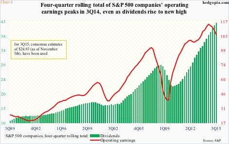
One look at Chart 4 and it is easy to see the important role dividends have played since Great Recession ended. Dividends per share for S&P 500 companies bottomed at $5.35 in 3Q09 and were $10.79 in 3Q15. The chart uses a rolling four-quarter average for both dividends and operating earnings – $42.51 and $103.64 in 3Q15, respectively. The former is at a new high, while the latter peaked at $114.51 in 3Q14.
Therein lies the rub. The two variables in Chart 4 do tend to move in tandem. Unless the red line turns around and begins to trend up again – possible but not probable – the green bars should begin to catch up with the red line lower sooner or later.
That is a bad combo along with the rise in the price to sales ratio.
Thanks for reading!

