
- Different messages coming out of two financial ETFs – KBE vs. XLF
- KBE similar to KRE, regional bank ETF, while XLF is large cap-dominated
- C&I loans have been growing nicely, but so is inventories-to-sales ratio, muddying picture
How did U.S. financials do last year?
Most of us tend to immediately look at XLF, the SPDR ETF for the sector, and answer 15.1 percent (Chart 1), which by the way was better than the 11.4 percent on the S&P 500 large cap index.
But then again we live in an age of ETFs. There are 1,500 of them out there. Too many choices. And they are not all cut from the same cloth.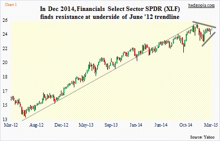
If at the beginning to 2014 you thought financials would outperform and put your money in XLF, you did pretty well. But if instead you chose KBE (SPDR KBW Bank Index ETF), you would have substantially underperformed the market. The ETF was up only 2.8 percent last year.
By the way, such variance obviously is not limited to financials. In biotech, for instance, IBB (Biotech iShares) was up 33.8 percent last year, while XBI (SPDR S&P Biotech ETF) was up 45 percent and BBH (Market Vectors Biotech ETF) up 30.3 percent. They are all biotech ETFs all right, but with so much variance in performance.
What determines that?
The makeup, of course.
Let us stay with financials for this purpose.
XLF, which makes up 16 percent of the S&P 500), has 85 holdings. I was surprised to find that BRK.b has been given the largest weight – 8.8 percent. The next four are made up by money-center banks – WFC (8.7 percent), JPM (7.7 percent), BAC (5.6 percent) and C (5.4 percent). Other notables include AIG (2.6 percent), GS (2.6 percent) and AXP (2.4 percent).
Last year, BRK.b was up 26.6 percent, C 3.9 percent, BAC 15.7 percent, WFC 24.1 percent, and GS 10.8 percent. The ones that mattered performed, and that helped XLF.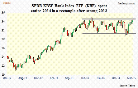
KBE, on the other hand, has a completely different makeup. It has 62 holdings. BRK.b is not in it. The big four money-center banks are not given the maximum weights, with WFC at 1.59 percent, JPM 1.57 percent, C 1.54 percent and BAC 1.45 percent. BKU and WBS have the maximum weights of 1.81 percent and 1.8 percent, respectively. Both are regional banks, with market caps of $3.4bn and of $3.3bn, in that order.
Here is the interesting part. BKU and WBS have also been given the maximum weights in KRE (SPDR KBW Regional Banking Index ETF) – 1.56 percent and 1.55 percent, respectively. The ETF has 84 holdings, and obviously does not contain money-center banks.
As a result, KBE and KRE do not have a whole lot of difference when it comes to performance, with the former rising 2.8 percent last year versus 1.9 percent for KRE. March-to-date, they are both up 3.2 percent, versus XLF’s 0.9 percent.
The similarity between KBE (Chart 2) and KRE (Chart 3) can best be seen in charts. Both pretty much spent the entire 2014 digesting the gains made in 2013. This is similar to what took place on the Russell 2000 small cap index (not shown here). The latter recently broke out of its one-year congestion. The breakout is not very convincing, but it has held so far.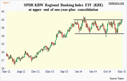
Both KBE and KRE could very well be on the verge of a breakout as well. The rectangle formation they have been in for the past year tends to be a continuation pattern. The only problem is that the consolidation has gone on for too long.
In contrast, XLF did not feel the need to digest 2013 gains with a sideways move. It continued to rally, but peaked late last year. As a result, its chart looks way different from those of KBE and KRE. The large cap-dominated ETF is sending a different signal versus the ones dominated by regional banks.
It is possible the prevailing chatter/commentary around the Fed getting ready to tighten due to improving economy has something to do with it. Regional banks, by nature, have domestic exposure. The price action of these two ETFs also runs in contrast with a barrage of disappointing data the past several weeks (except employment numbers).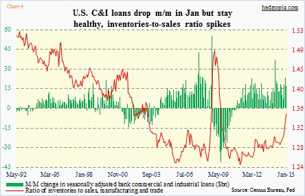
Or maybe they are responding to the increase in commercial and industrial loans. Year-over-year growth shifted into double digits in April last year and that momentum has continued. In January, they grew 13.4 percent. While this is all encouraging, the not-so-good news is that this has been accompanied by a sharp rise in inventories (Chart 4).
Nonetheless, a genuine breakout has the potential to ignite further buying interest.
