NYSE margin debt just made an all-time high of $507.2 billion in April. It fell 1.6 percent in May. This was the first month-over-month drop in four months. In the first five months this year, it grew nearly $43 billion. In the comparable period last year, margin debt fell north of $6 billion. In fact, in all of 2014, it only managed to grow a little north of $11 billion. So going by the pace so far this year, debt accumulation is accelerating.
If this sustains, what might this mean for things ranging from stocks to bank loans?
Below are three charts that attempt to throw light on this.
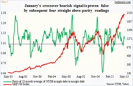
In Chart 1, the green line is the ratio of 12-month moving average of margin debt to actual margin debt. The olive line is drawn at one. Whenever the green line crosses below parity and sustains, it has brought bad news to the red line, representing the S&P 500 Index. In 2007, stocks peaked In October 2007, and the ratio went under one in December that year. In 2000, on a closing basis, the S&P 500 peaked in August, and the green line crossed parity from above in October.
Most recently, the crossover took place in January; the ratio was at 0.98. Turns out it was a false signal. The next four months, it registered readings of well above one.
Hence if the past is any guide, the green line is not yet forecasting a meaningful drop in stocks. Now it is true that at least during the last two bear markets stocks peaked a couple of months before the green line peaked. So far, the 2134.72 intra-day high on the S&P 500 was recorded on May 20. From this perspective, margin-debt in June, when out, probably takes on additional importance.
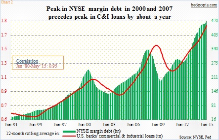
Then we have Chart 2. Margin debt is pitted against U.S. banks’ commercial and industrial loans. A 12-month rolling average is used for both. Once again, going back to the last two major peaks, margin debt has tended to peak about a year ahead of the peak in C&I loans. As stated previously, margin debt peaked in April, and C&I loans are still going strong. In June, they were $1.9 trillion, up $209 billion year-over-year. Momentum is intact.
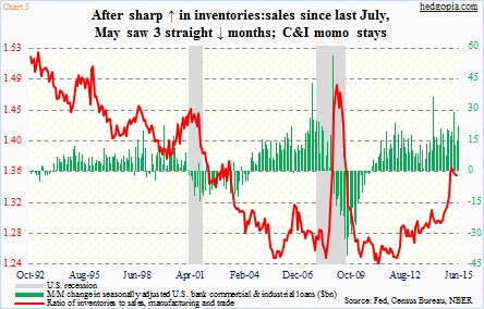
Of course, the worry is that these loans are being used to finance inventory buildup, which is highlighted in Chart 3. The ratio of inventories-to-sales has spiked beginning last July. One ray of hope: Since the February high of 1.368, the ratio has declined the next three months. But it remains elevated.
So it is entirely possible the correlation between margin debt and C&I loans this time around gets broken. Ditto with the relationship between the S&P 500 and margin debt. After all, we do live in a cycle in which abnormal is the norm – ranging from zero interest-rate policy that has gone on for over six years to real GDP that has only managed to grow at a seasonally adjusted annual rate of 2.2 percent post-Great Recession to sluggish wage growth, just to name a few.
Be that as it may, Charts 1 and 2 are worth paying attention to.
Thanks for reading!

