
Last year, with the bull market in its seventh year, a June 19th post sought to find out where several valuation metrics stood. The conclusion was that they were in uncharted territory. With three more quarters of data since, a revisit is probably in order.
Below is an update using 4Q15 numbers.
That post used 1Q15 numbers, and most metrics were at cycle highs back then. This time around, most have turned down.
Simplistically, it can be argued that a process of unwinding has begun, with the caveat that most inched up in 4Q15.
The question is, is 4Q15 merely a pause in a downtrend already in motion or that was the extent of the drop for now?
Short-term variations obviously are unpredictable. Longer-term, excesses get unwound. They always do. It is just a matter of time. History has taught us that.
Here is an example of short-term oscillation.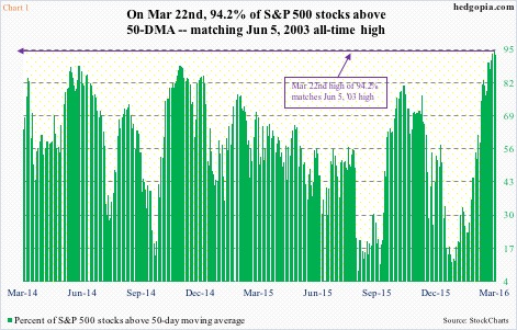
During the January sell-off in stocks, the percent of S&P 500 stocks above 50-day moving average dipped to nine percent – the lowest since September 1, 2015. Two months later, on March 22nd, it surged to 94.2 percent – matching the all-time high of June 5, 2003. From one extreme to another. When it dropped to nine percent on January 20th, it was a safe bet to expect a reversal to the upside. Now that it is north of 90 percent, it will reverse, too, this time to the downside.
The five charts below are the same away. They are way extended. Unwinding will take place – sooner or later – or may have already begun. We can just go back to the last two bear markets to find out how sentiment swings from one extreme to the other.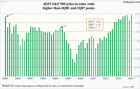
Chart 2 portrays price-to-sales ratio for the S&P 500 using a four-quarter rolling average of sales of the constituent companies. In 2Q07, it jumped to 1.52 before peaking. What followed was a nasty bear market. In the one before that, the ratio rose as high as 1.8 in 4Q00. Once again, these excesses were unwound as stocks got pummeled. In 4Q15, the ratio rose even higher, to 1.81.
Side note: unlike reported earnings, sales are less susceptible to manipulation.
Tobin’s Q is an often-quoted ratio in finance. Named after its developer, James Tobin, it is a ratio of market cap to replacement cost of related companies. We can also measure a company’s net worth using book value, but the latter uses the original cost. A lower Q suggests there is value, and vice versa.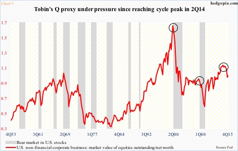
In Chart 3, a proxy of Tobin’s Q has been calculated by dividing U.S. non-financial companies’ net worth into their combined market value – respectively $22.8 trillion and $21.7 trillion in 4Q15. In the quarter, the ratio inched back up to 0.95 from 0.93 sequentially, but is down from 1.09 in 2Q14, which was the highest second only to 1.61 in 1Q00. Should 2Q14 represent a cycle peak, more unwinding probably lies ahead.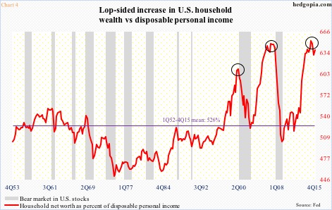
That is also the case looking at Chart 4. In it, U.S. households’ disposable personal income is compared with their net worth. In 4Q15, they respectively were $13.6 trillion and $86.8 trillion. Since the end of Great Recession, they have respectively grown by 23.6 percent and 56.1 percent. Quite lop-sided! And this is primarily due to the recovery in stock prices.
In fact, the red line in Chart 4 reached the highest in 1Q15 at 653 percent, higher than during the last two bear markets.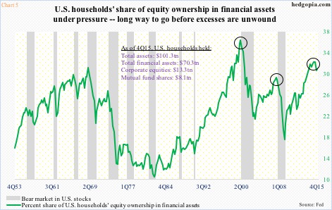
Chart 5, too, focuses on U.S. households, and this time through their equity exposure. The green line shows their equity ownership in financial assets. In 1Q15, it peaked at 31.9 percent, then dropping to 30.5 percent by 4Q15. How excessive was the 1Q15 peak? It was higher than the 29 percent in 2Q07 but lower than the all-time high 36 percent in 1Q00. And we all know how those excesses got unwound. Risk/reward dynamics favor this one, too, will meet the same fate – in due course.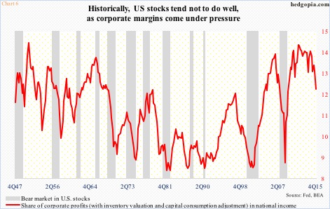
If developments so far are any indication, Chart 6 is well on its way. In fact, of the last five charts on this post, this one has gone the farthest in the way of unwinding excesses. The red line is essentially corporate operating margins, calculated by dividing national income into corporate profits.
In 4Q15, corporate profits before tax adjusted for inventory and capital consumption were $1.9 trillion and national income $15.7 trillion. The latter was at an all-time high, while profits peaked at $2.16 trillion in 3Q14. As a result, the red line in Chart 6 is under pressure.
Further, the current trend in earnings does not suggest things will change for the better anytime soon.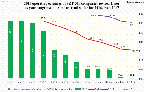
Operating earnings of S&P 500 companies for 2015 were $100.43. For some reference, 2014 was $113.02, and at the end of 2Q14, 2015 was expected to earn $137.50! That was also the amount 2016 was expected to bring in at the end of 2014. Fast forward to estimates as of March 17th, and 2016 has now been revised lower to $118.57 – probably still too high. Next year is the same way. Early estimates are very optimistic – currently $136.40, which are already down from $141.11 when they were introduced in the middle of this January (Chart 7).
Earnings deceleration is probably the biggest risk facing these metrics. Risk of continued unwinding grows should earnings fail to behave.
Thanks for reading!
