
U.S. households have experienced steady growth for two and a half years, but also lag vis a vis growth in several other metrics. Steep rise in home prices possibly to blame?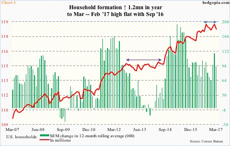
After going sideways for nearly two years (indigo bi-directional arrow in Chart 1), U.S. household formation began to grow in September 2014. Nothing crazy. Just a gradual, steady uptrend.
March was down 0.4 percent month-over-month to 118.6 million. February’s 119 million essentially tied with last September.
The red line in Chart 1 has a flattish look to it, but it is too soon to declare as such. More important is how household formation is not keeping up with several other metrics.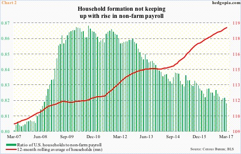
Chart 2 plots a ratio of households to non-farm employment with a 12-month rolling average of households.
First off, the red line continues to rise. March was 118.6 million – a new high. That said, as has been the case in the past, it is also normal for the red line to witness a sharp jump and then either go sideways or decelerate. In the latter scenario, the green bars can continue lower.
New household formation began lagging non-farm payroll in late 2010.
This despite the fact that payroll growth itself is in deceleration. Year-to-April, non-farm payroll averaged a monthly increase of 185,000. In 2016, it averaged 187,000, slower than 226,000 in 2015 and 250,000 in 2014.
The same phenomenon is evident in sales of homes.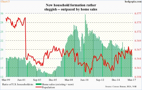
Chart 3 uses two ratios – one versus home sales and the other versus population.
Sales of both existing and new homes have been added together for this purpose.
In March, sales of existing homes rose 5.8 percent m/m to a seasonally adjusted annual rate of 5.71 million units – the highest since February 2007 – and sales of new homes rose 4.4 percent to 621,000 units (SAAR) to nearly match last July’s eight-and-a-half-year high (622,000).
As was the case with non-farm payroll, household formation began lagging home sales in 2010 (Chart 3). Versus U.S. population (324.9 million, March), the ratio has been flat for nearly 11 years. The red line has been under pressure since peaking last September.
Here is the thing.
Post-Great Recession (July 2009-present), the household-to-population ratio has averaged .363, versus an average .369 during January 1980-June 2009, which encompasses five recessions. If household growth maintained a ratio of .369, March would end at just shy of 120 million, 1.4 million more households than what we have now.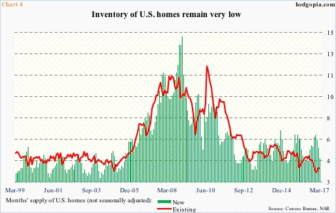
This would reverberate through a whole host of things, not the least of which is housing. Particularly considering how suppressed the supply of homes is currently.
In March, months’ supply of new homes (not seasonally adjusted) stood at 4.6. Supply has been under pressure for a while, but saw a sharp drop from 6.5 last December. On the existing side, March was 3.8, with 3.5 this January the lowest since at least January 1999. 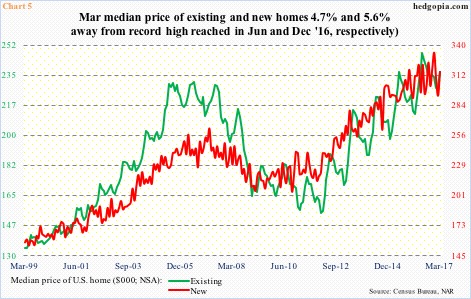
The limited supply has helped put upward pressure on the price.
Sales are holding up just fine, but nothing compared to bubble highs – all-time high of 1.39 million in July 2005 (new) and 7.26 million two months later (existing).
The median price in the meantime has galloped ahead, with existing having peaked at $247,600 last June (March 2017 at $236,400) and new at $332,700 last December (with March at $315,100).
This cannot be contributing toward new household formation.
There are probably many reasons behind sluggish growth in household formation – sluggish income growth being one. The rapid rise in home prices cannot be ruled out as a potential contributor in this regard.
Thanks for reading!
