
As far as U.S. stocks were concerned, Brexit was just a bad dream. A footnote, so to speak. On the S&P 500 large cap index, the intra-day high of 2113.32 in the session before Brexit hit stands, but last Friday’s intra-day high of 2108.71 came very close (Chart 1).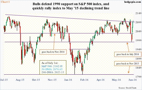
In between, in a couple of sessions through the intra-day low 1991.68 on Monday last week, the S&P 500 lost 5.8 percent. This was then followed by an intra-day low-to-high 5.9-percent surge in four sessions. Using closing prices, the four-session rally was 5.1 percent, which is what is shown in Table 1.
On a weekly chart, it is as if Brexit never happened, with last week producing a massive hammer reversal – potentially a bullish development.
Last Friday, the index literally closed on a slightly declining trend line drawn from the all-time high of 2134.72 in May last year. A breakout here, followed by a break out of that high, will be massive. The S&P 500 has essentially been going sideways for the past 16 months now.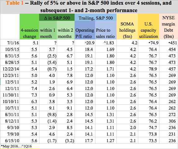
Bulls can take heart from the fact that last week’s four-session surge of north of five percent puts them on the right side of history.
Table 1 tallies instances of rallies of five percent or above on the S&P 500 over four sessions. Going back six years, there have been 16 such instances. Between March and July in 2009, there were 13 more instances, and they have been excluded from the table. The bull market had just begun in March 2009, and such spurts were obvious and common. From 666.79 in March, 2009 ended at 1115.10.
Focusing on the 16 instances in the table, a trend emerges. Except for once, which was in June 2010, the S&P 500 is higher two months later in each of the remaining 15 instances. One-month change is not as consistent, nevertheless is higher more times than lower.
Hence the question, will history repeat itself?
Once again, the S&P 500 has been sideways for 16 months now. A breakout can feed on itself, especially considering elevated short interest, and the potential for a squeeze. Whether or not other factors also highlighted in the table would influence investor psyche remains to be seen.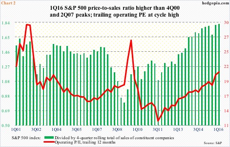
Table 1 also plots price-to-earnings and price-to-sales ratios for the S&P 500, the Fed’s System Open Market Account holdings, U.S. capacity utilization, and NYSE margin debt. Where they stood in the past, when similar rallies unfolded, versus where they are now might help assign odds of history repeating itself this time around.
First off, the price-to-sales ratio for S&P 500 companies has persistently risen over the years, meaning if it made sense to go long, let us say, in 2011, not so now. At 1.83 in 1Q16, the ratio was the highest ever (Chart 2) – higher than in 2Q07 and 4Q00. Ditto with the price-to-earnings ratio using operating earnings for trailing 12 months, with 1Q16 at 20.9 – the highest since 3Q09.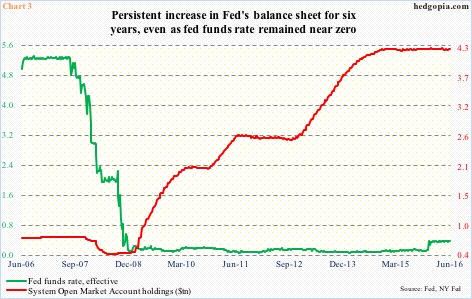
One of the reasons why global equities quickly reversed post-Brexit drop is investor talk/hope that central banks would act in a coordinated fashion to lessen whatever pain Brexit might cause. There is reason for such optimism, as major central banks have been very active on this front since the financial crisis, using both conventional and unconventional measures.
In the U.S., the Fed pushed the fed funds target rate near zero way back in late 2008 and kept it there. Around the same time, it began quantitative easing (QE). After three iterations, QE was put to rest in October 2014… U.S. stocks correlated very well with it.
SOMA holdings went from under $500 billion in late 2008 to $4.2 trillion when QE was unwound. The red line in Chart 3 has been flat since. The case for another round of QE was easy when SOMA holdings were $2 trillion than it would be when they were north of $4 trillion.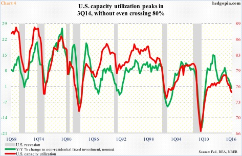
Post-Great Recession, U.S. capacity utilization peaked at 78.9 percent in November 2014 before coming under pressure. Business capex correlates tightly with utilization (Chart 4). May this year came in at 74.9 percent. Utilization has dropped for 15 straight months year-over-year, and never crossed 80 in this cycle. While this throws light on how weak economic growth has been, ideally this should also enhance the odds of more stimulus. But then again, Chart 3 might come in the way.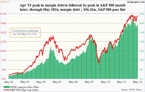
Last but not the least, margin debt has been a good source of funds in the current bull market. It peaked at $507.2 billion in April last year, up from $173.3 billion in February 2009. The bull market began in March that year.
Rather coincidentally, the S&P 500 peaked in May last year, a month after the peak in margin debt (Chart 5). This May, margin debt fell $4.6 billion month-over-month to $451.1 billion, even though the S&P 500 rallied 1.5 percent. The two correlate tightly. But as elevated as margin debt already is, it is hard to imagine it growing aggressively from here, as it did in previous years.
None of the four metrics above suggest a decent rally in stocks is imminent. But the three columns in green shade in Table 1 beg to disagree. It probably pays to have an open mind. At least in the short-term in particular, markets do/can pull off a surprise. Hence crossed fingers.
Thanks for reading!
