
It is not easy getting a handle on valuation dynamics. During good times, multiples rise to exorbitant levels, and the opposite happens when times are bad. The usual cycle of things.
Come to think of it. At any time, value is what the other side is willing to pay. If we agree with this premise, then it is normal for multiples to both overshoot and undershoot. What is certain is that things tend to revert to the mean. Below are six charts that are testament to this phenomenon.
Right now, multiples are on the high side, some really high. Most of them seem to have begun a process of unwinding, but it is never a straight line, rather stop-and-go.
A March 24th post dealt with this issue using 4Q15 numbers. Here is an update using 1Q16 numbers.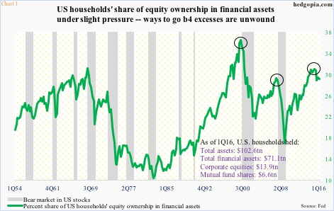
In Chart 1, as the green line, representing the share of U.S. households’ equity ownership in financial assets, comes under sustained pressure, a bear market in stocks follows. In 1Q00, equities’ share surged to 36.1 percent before giving way to a bear market. In 2Q07, a bear market began much sooner – from a 28.9-percent ownership. This time around, it rose to 30.7 percent in 1Q15, surpassing the 2Q07 level, before turning down, but a bear market is yet to begin.
The May 2015 high 2134.72 on the S&P 500 index has not yet been breached. Using that high through the February 11th low, the index dropped just north of 15 percent. If the drop was to the tune of 20 percent, or higher, technically a bear market would have begun back then.
That said, the green line in Chart 1 is dropping, with 1Q16 at 28.8 percent, and, from the mean-reversion point of view, probably has a long way to go on the downside.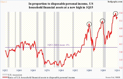
Ditto with Chart 2, which plots disposable personal income with financial assets. Post-Great Recession, they have both grown – the former from $10.99 trillion in 2Q09 to $13.75 trillion in 1Q16 and the latter from $45.98 trillion to $71.08 trillion. The difference in growth is apparent. Growth in disposable personal income has not kept pace with growth in financial assets. Hence the new high in the ratio of financial assets to disposable personal income in 1Q15, exceeding the prior peaks of 1Q00 and 2Q07.
Disposable personal income can also be compared with household net worth and see if the two have been moving hand in hand. Quite the contrary. As Chart 3 shows, growth in the latter has been quite lopsided in the current recovery, having increased from $55.61 trillion in 2Q09 to $88.09 trillion in 1Q16.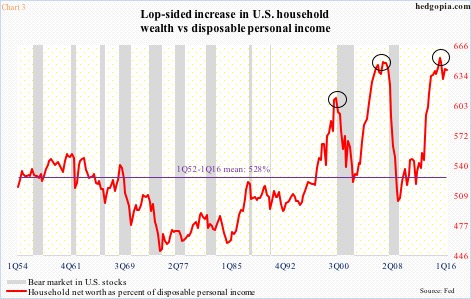
If we just focus on net worth, households’ balance sheet looks very healthy – assets of $102.62 trillion versus $14.54 trillion in liabilities. Besides stocks that are near all-time highs, thanks to surging home prices, household real estate was worth $25.79 trillion in 1Q16, past the prior peak of $24.86 trillion in 4Q06.
But once again, disposable personal income has not kept pace. In Chart 3, the red line represents household net worth as percent of disposable personal income, and made a new high in 1Q15 – 652.7, versus prior peaks of 648.3 in 4Q06 and 611 in 1Q00. The mean is 527.7.
One reason why household income has not improved much is because corporations in this cycle have been taking an increasing share of national income versus employees. This is reflected in sluggish wage growth, etc.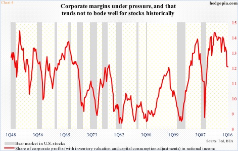
The red line in Chart 4 – essentially corporate margins – made a cycle high of 14.5 percent in 4Q11, essentially matching 14.59 percent in 4Q50, before going sideways to slightly down. It is only since the 14.16-percent print in 3Q14 that margins have come under real pressure. At least historically, stocks have struggled in a time like this. That is yet to transpire in the current cycle. Stocks have been resilient, particularly so considering the prevailing earnings deceleration. Earnings multiples are extending.
That is also the case based on price to sales.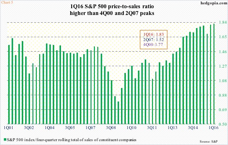
Using a four-quarter rolling total, S&P 500 sales peaked at $1,163.32 in 4Q14, with the S&P 500 index closing the quarter at 2058.9. In 1Q16, the price was essentially unchanged at 2059.74, but sales had decelerated to $1,128.43. Consequently, the price-to-sales ratio jumped from 1.77 to 1.83. The 4Q14 ratio (1.77) was already high enough to match the prior peak in 4Q00 (not shown in Chart 5); 1Q16 took it to another level, a new high of 1.83.
And last but not the least, Tobin’s Q is another way to measure valuation.
The ratio has total market value in the numerator and assets in the denominator. A low ratio means the cost to replace assets is greater than what the assets are worth. Conversely, a high ratio – north of one – suggests markets are assigning a higher value than the replacement cost of the assets. Thus when the ratio is over one, it implies overvaluation.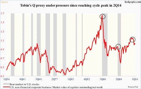
Chart 6 is a proxy of Tobin’s Q. U.S. non-financial companies’ net worth is divided into market value of their equities. In 1Q16, they were respectively $22.35 trillion and $21.69 trillion, for a ratio of 0.97, suggesting things are not terribly expensive. The red line has been under pressure since 1.1 in 2Q14.
Nevertheless, this metric also tends to overshoot and undershoot a lot, as is evident in the prior two cycles. In fact, in 2Q07, it began retreating from a reading of 0.911, bottoming at 0.542 in 1Q09, implying it can go a lot lower in a bear market. Whenever the next one shows up.
Thanks for reading!
