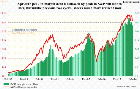
NYSE margin debt fell $11.9 billion month-over-month in February to $435.8 billion. This was the 10th month since the $507.2-billion peak last April. Margin debt has dropped 14 percent since that peak (Chart 1). For some historical perspective, in 2000 and 2007, within 10 months of the peak, margin debt fell 29.2 percent and 18.6 percent, respectively.
Using the February close, the S&P 500 index lost 7.4 percent since the April 2015 peak in margin debt. Similarly, within 10 months of the peak in margin debt, it dropped 8.9 percent in 2000/2001 and 3.8 percent in 2007/2008; within a year, however, the index was down 22.6 percent and 12.9 percent, respectively.
If the current cycle follows the pattern of the past two cycles, April could go the way of the bears, although stocks have so far been resilient even in the face of compression in margin debt.
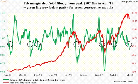
One way to explain how stocks acted in 2000/2001 and 2007/2008 as time went on is sheer momentum. Momentum in reverse, that is. Persistent drop in margin debt can set in motion the classic ‘selling begets selling’ phenomenon. That is why Chart 2 is worth watching. The circles in the chart are significant developments in that the green line, which is a ratio of margin debt to its 12-month moving average, drops below one and persists. The idea is simple, once margin debt drops below its long-term average, momentum would have been lost. Currently, the green line in Chart 2 has been below one for seven straight months.
Yet, stocks have been holding up better than in past cycles.
One crucial difference is that the Fed is much more active now versus then. The so-called Fed put has created a floor of sorts underneath stocks. We will find out to what extent this emboldened the bulls in March, or whether or not they were putting money where their mouth was. The S&P 500 surged 6.6 percent last month. Did margin debt play a role in this? We will find out in a month.
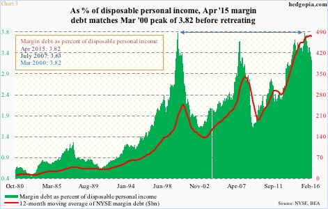
Regardless what happens in March, here is another way of looking at margin debt dynamics showing why the April 2015 peak could be significant. Chart 3 plots the 12-month moving average of margin debt against margin debt as a percent of disposable personal income.
First of all, the red line in Chart 3 has been flattish to slightly down for the past several months. Once again, it signifies waning momentum. And it has come at an interesting juncture. At the high last April, margin debt made up 3.82 percent of disposable personal income, and has been in decline since. There have been three distinct spikes, followed by reversals – 2015, 2007, and 2000. Guess where 2000 peaked at? At 3.82 percent. Shows how excessive things had gotten. And if past is prelude, unwinding is a process and takes time.
Thanks for reading!

