
The chart below has fodder for both bulls and bears.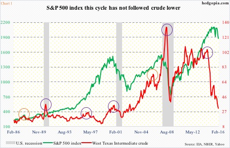
At least going back to the last three decades – encompassing three recessions, including Great Recession – there have been five occasions in which the spot West Texas Intermediate crude has dropped at least 40-plus percent, including one currently in progress (indigo circles in Chart 1). In 1987 and 2006, it dropped 25-plus percent (orange circles).
Drops of this magnitude have never been followed by recession. This is the point the bulls make. All three recessions in the chart preceded a spike in oil – either before or during contraction.
However, in three out of the previous four times oil dropped 40-plus percent the economy was either already in contraction (1990 and 2008) or about to begin one (2000). Between the June 2014 high and the low this January, spot WTI collapsed 71 percent. Hence the bears’ argument that the economy is on the verge of contraction.
Chart 2 is the same way.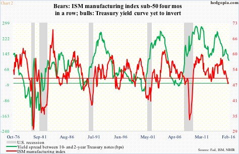
In it, the ISM manufacturing index has been plotted against the spread between 10- and 2-year Treasury yields. The chart covers four decades and five recessions. The thin horizontal red line is drawn at 50 (pertaining to ISM manufacturing), and the thin green line at zero (10-2 spread).
As can be seen, each recession has been preceded by yield curve inversion (the 10-year yield dropping below the two-year). In the current cycle, it is yet to occur, with the spread at 112 basis points last Friday. So those who swear by this indicator do not expect the economy to contract anytime soon.
That said, in all fairness, unlike past cycles, thanks to the Fed’s zero interest-rate policy, short-term rates are artificially suppressed, making it awfully hard for the curve to invert. So not sure if this indicator is as reliable as in the past, which is a point made by the bears.
They also point out the persistent decline in manufacturing since August 2014, with the last four months sub-50. There have been times in the past when the index dropped into contraction mode (below 50), but the economy acted just fine. The most recent example of this was in November and December 2012.
However, in all five recessions, the red line in Chart 2 ended up going much lower once it began to get traction.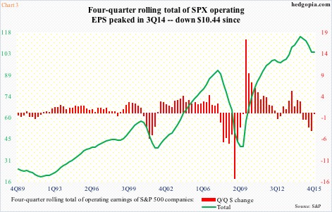
Notably, manufacturing is contracting even as corporate profits have peaked – historically this is not always the case. November/December 2012, for example.
Operating earnings of S&P 500 companies peaked at $29.60 in 3Q14. Since 4Q14, they have been shrinking year-over-year – five straight quarters of contraction.
Chart 3 uses the four-quarter rolling average of earnings, and it is the same trend. The green line peaked at 3Q14 at $114.51. Using the expected $26.68 in 4Q15, the red bars have had negative readings the past five quarters.
Can profits snap back? Always possible. But is it probable? No.
Estimates for this year are $119.91, which would represent growth of north of 15 percent over 2015. This would represent quite a trend change as 2015 is set to decline just under eight percent over 2014.
Besides, at the end of 2Q14, 2015 estimates were $137.50… now they are $104.06. Even 2016 was expected to come in at $137.50 as early as February last year. Not surprisingly, 2017 starts out way too optimistic – currently $139.41.
There is the rub. If 2016 estimates are met, the sell-off in stocks may just turn out to be a pause that refreshes, which is the bulls’ point. To the bears, this is the beginning of something nasty.
Both sides can pick and choose to suit their own biases. However, if we listen to the collective wisdom of markets, the message is that of caution. The quick deterioration in technicals as soon as the year began is worth paying attention to.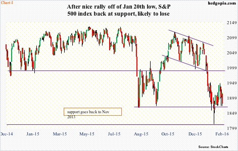
After a brief rally off the January 20th intra-day low, the S&P 500 is back at support. If it loses that – probable – support at 1815-ish once again comes into play. It is a must-hold. The green line in Chart 1 has a lot of catch-up to do.
Thanks for reading!
