
U.S. household formation seems to be stalling. Again.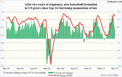
Last year, there were 117,707 households in December, 117,342 in April, and 117,816 in October.
When Great Recession ended, there were 110,284 households in June 2009, and grew steadily, to 114,720 in August 2012. For the next two years, there was no new formation. In August 2014, there were 115,048 households. This was a period in which non-farm payroll averaged a monthly addition of 205,000 jobs – decent but not going gangbusters.
Household formation picked up steam from September 2014, adding 2.7 million households through last December. Non-farm payroll averaged 240,000 during the period. Although, as stated earlier, momentum of late has been going flat/slowing down.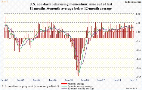
Chart 2 calculates a 12-month moving average of households. The month-over-month change peaked in April last year at 194,000, before gradually losing steam. By December, this had decelerated to 73,000.
The significance of this cannot be emphasized enough. Repercussions will be felt across the economy, including housing.
Here is the rub. The stall in momentum in household formation is coming at a time in which momentum in non-farm payroll is flat at best and decelerating at worst.
In Chart 2, the six-month average of non-farm job creation has crossed below the 12-month in nine out of the last 11 months. After two months of positive crossover in November and December, January again went back below it. Interestingly, this was a period that saw strong job growth, with October 2015-January 2016 adding an average of 247,000. But January only produced 151,000.
The reason both these averages have been decelerating since February 2015 is primarily this. In 2015, a monthly average of 228,000 jobs were added. In 2014, this was 251,000. Because of the healthy growth in non-farm jobs in October-December last year – averaging 279,000 – the averages will probably swing higher in the next few months, but for momentum to stay intact the jobs picture has to substantially improve from January’s disappointment.
On this score, developments in unemployment insurance claims are worthy of note.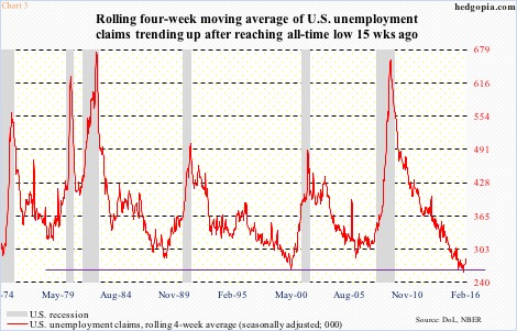
Chart 3 presents the four-week moving average of unemployment insurance claims. In the March 28, 2009 week, they peaked at 659,250, just as the economy was coming out of Great Recession. In the October 24th week last year, they bottomed at 259,250. This was the lowest ever. Claims were 284,750 in the January 30th week.
Historically, any time the red line in Chart 3 makes a trough and pushes higher, it is worth paying attention to. Going back to the last six recessions, any time it reverses higher from lows around here, in due course a recession has followed.
This is just one scenario, and obviously will have implications for Chart 1 should it pan out.
Thanks for reading!
