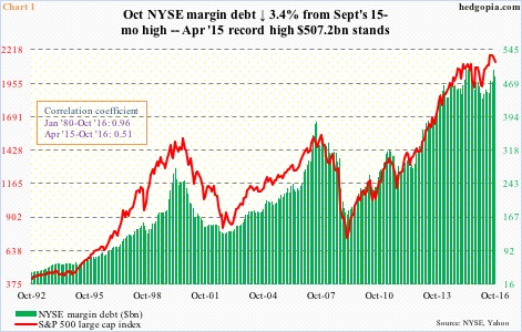
NYSE margin debt dropped 3.4 percent month-over-month in October to $484 billion; the S&P 500 fell 1.9 percent in that month. Debt rose 6.3 percent in September to a 15-month high $501.1 billion.
Margin debt peaked at $507.2 billion in April last year. The S&P 500 large cap index peaked one month later, at 2135. The index then bottomed in February this year at 1810, which was coincided with a trough in debt in that month at $435.8 billion.
Correlation between the two is tight – .96 going back to January 1980. That said, since that April 2015 peak in margin debt, correlation has weakened.
In July this year, for instance, the S&P 500 broke out to a new high – past the May 2015 peak. Not margin debt, which stood at $474.6 billion. In September, margin debt jumped $30 billion m/m, but the S&P 500 fell 0.1 percent.
Mindful of the rather weak correlation between the two of late, here are three different perspectives.
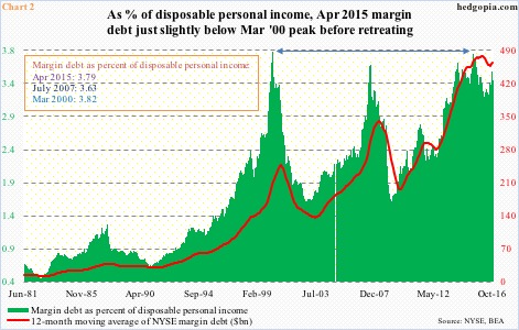
Compared to income, margin debt remains way elevated.
U.S. disposable personal income was $14.3 trillion (seasonally adjusted annual rate) in October. When Great Recession ended in June 2009, it stood at $11 trillion. Margin debt stood at $188.1 billion back then. Clearly, the growth rate between the two is not even comparable. (Incidentally, margin debt bottomed at $173.3 billion in February 2009, the S&P 500 bottomed the following month, in early March.)
Chart 2 plots margin debt as a percent of disposable personal income against its 12-month moving average. When debt peaked in April last year, the green bar rose to the second highest ever – 3.79 versus the all-time high of 3.82 in March 2000.
The difficulty in using this as a signal is this. Unlike in the prior two peaks of 2000 and 2007, the green bars did drop from the April 2015 peak, but also stabilized soon. The red line has now hooked up.
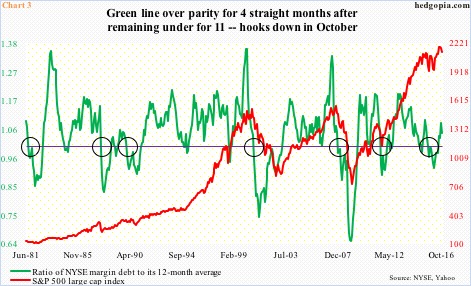
Or take Chart 3. The green line represents a ratio of margin debt to its 12-month average. Once it drops below one and sustains, stocks tend to go through a rough patch (indicated by circles).
Most recently, the green line dropped below parity in August last year and stayed there until June this year. The 11-month stretch was characterized by two 10-plus-percent declines in the S&P 500. Through October, the line remained above parity for four months. At the same time, in October it hooked down.
The problem is, the green line uses an average, not absolute margin debt. Hence it tends to lag the S&P 500. For instance, as noted above, the index peaked in May last year, but the green line only dropped below parity in August, even though margin debt (absolute) peaked in April.
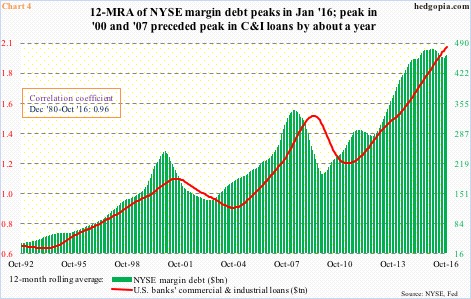
Historically, the 12-month rolling average of margin debt has shown a tendency to peak ahead of U.S. banks’ commercial & industrial loans by about a year. This time around, the green bars in Chart 4 peaked in January this year. C&I loans, of course, are yet to roll over. But unlike the prior two peaks, the green bars have refused to continue to drop. Rather, they bottomed in August. Margin debt was up big in September, so obviously that played a role.
From this respect, November’s margin debt, which will be published in a little less than a month, has taken on added significance. The S&P 500 was up 3.4 percent in that month – to a new record. (By the way, from the May 2015 high to the November 2016 high, the index rallied 3.7 percent, margin debt, however, is still below the April 2015 peak.)
Hence, if November did not make a new high in margin debt, or at least had a very healthy increase, then odds grow that the green line in Chart 3 continues lower, that the April 2015 peak in the green line in Chart 2 stays, and that the red line in Chart 4 begins a process of rolling over.
Thanks for reading!

