
Below is one of the charts often used – this blog including – to validate expectations for imminent upward pressure on U.S. wages. It shows the correlation between year-over-year change in average hourly earnings of production and non-supervisory employees and compensation plans of National Federation of Independent Business members. Businesses’ plans take time to show up in employee earnings, so the red line is advanced by nine months.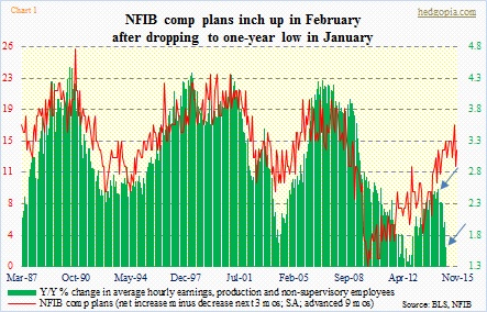
The correlation between the two seems tight in the chart. Going back to January 1987, R is 0.56, which is not very high but good enough. Directionally, they follow each other.
Since a year ago, that relationship has pretty much broken down. In February last year, the green bar grew 2.5 percent, and since has persistently decelerated. Last month, it only managed 1.6 percent growth (blue arrows in Chart 1). The red line, however, has stayed flat at 14 during the period, with a high of 17 and a low of 12.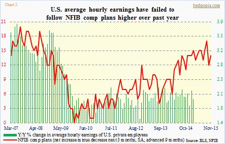
The picture looks slightly better when one includes all private-sector employees (Chart 2). Production and non-supervisory employees are about 80 percent of non-farm payroll, and in February were paid $20.80/hour. Average hourly earnings for all employees were $24.78/hour. The remaining 20 percent is made up of higher-up positions, pulling the average up. Their earnings grew two percent in February, versus 2.1 percent a year ago. Flattish, sill much better than how production and non-supervisory employees are faring. Nonetheless, as is the case in Chart 1, the red line has diverged from the green bars.
This does not help the ‘wage hike just around the corner’ argument.
Just have a feeling this will be a hot topic of discussion between doves and hawks when the FOMC meets next week.
