
 One more day, and one more post-Great Recession high on the Nasdaq Composite. In fact, the index is at a 14-year high, and yesterday was able to build on Monday’s breakout. There is of course a lot to quibble over the quality of the rally – from up/down volume to highs/lows to advance/decline. All these three metrics (not shown here) are nowhere near their recent highs even as the Composite just notched another multi-year high. Yet, price is the ultimate arbiter. Sellers are pretty much on strike, and traders are taking advantage of the low-volume environment. Kudos to them! The question is, what next? It is rather too soon to declare that the breakout is genuine and has lasting power. Price has spoken, participation has not. Since the current rally began eight sessions ago, volume has progressively receded. After the rally last week and week-to-date, Nasdaq’s medium-term technicals once again are overbought; ‘long-term’ has been in that territory for a while. Now, here is the thing. As discussed yesterday, the Nasdaq has been leading the S&P 500 Index since early June. During the recent sell-off, the latter began a process of unwinding overbought technicals but then stopped one third of the way as equities began to rally. There is room for these conditions to rise even more before they get overbought. This should bode well for the S&P 500 Index.
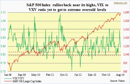
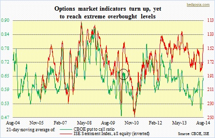 And then there is this. As can be seen in the chart above, the VIX:VXV ratio has room to go lower. The VIX of course measures S&P 500 volatility one month out, while the VXV is a measure of three-month implied volatility. Normally, the ratio tends to bottom out in the high-.70s to low-.80s range. The VXV has tended to be less volatile. One of the ways the ratio can drop is if the numerator drops faster than the denominator. From the recent highs, the VIX has dropped 32 percent, and the VXV 24 percent. While it is possible this pattern continues, the message coming out of the CBOE put-to-call ratio is even more interesting. In the adjacent chart, the green line began to turn up even as the S&P 500 Index began a sideways action early July. It is nowhere near close to getting to overbought conditions. But it also rose from a very low level – third lowest in the last one decade. Two outcomes are possible: (1) the 21-day moving average continues to move up, which would mean the rally in the S&P 500 stops soon, or (2) it turns lower, which, by the way, just got underway. In a latter scenario, the index continues higher. Going back a decade, this has happened once. Back in April 2010, the average turned up from a deeply oversold level, and peaked two weeks later (marked by a circle in the chart), preceding a rally in equities.
