
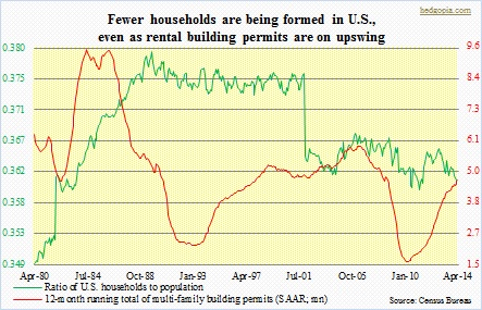
 There was a lot of excitement last week when housing starts/building permits data were released for July. Starts surged 15.7 percent month-over-month and 21.7 percent year-over-year to 1.1mn units (seasonally adjusted annual rate). Multi-family (five units or more) easily outran single-family (one unit). The latter rose 8.3 percent m/m and 10.1 percent y/y to 656k, while multi-family surged 33 percent m/m and 49.5 percent y/y to 423k units. Month-to-month, these data series tend to be volatile, but the trend has been up. Year-to-date, multi-family has jumped 25.1 percent, versus single-family’s relatively small 5.7 percent. The July number also matched the January 2006 high of 423k units – one more data to show the resurgence in multi-family units. That was when the historical housing bubble was at its strongest. That same month (January 2006), single-family units recorded a high of 1.82mn units; the July total of 656k is 64 percent off that high. In the accompanying chart, the 12-month running total of building permits is shown, and it is at its highest since July 2008.
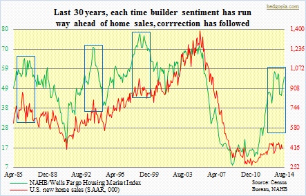 The surge in starts is in line with builder sentiment that is seeing a resurgence in optimism. The NAHB/Wells Fargo Housing Market Index (HMI) jumped 10 points from 45 in May to 55 in August, and has had quite a surge over the years. The index dipped to as low as eight in January 2009. Two things are worth pointing out in this respect. First, The HMI is calculated for single-family; the latest data point is as of August. So it is possible when August numbers come out, we see yet another jump in housing starts/building permits. Second, as can be seen in the adjacent chart, going back nearly 30 years, any time builder sentiment runs well ahead of new home sales, gravity goes to work. In the chart, three such previous occasions have been highlighted. And a fourth one is currently underway – a massive one at that. Going by history, the green line is simply too steep for its own good and is probably set to correct. The only thing is, there is no way to know when this process begins. What can be gleaned from the chart is that the red line, representing new home sales, moves in tandem with the green.
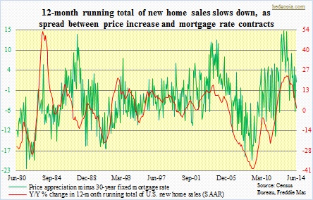 As a matter of fact, we are already beginning to see signs of that. Since the bubble burst, sales of new homes (SAAR) peaked at 459k in June 2013. That high was more or less revisited in January this year when sales came in at 457k. Since then, sales have been weakening – at 406k in June. In the chart, y/y percent change has been calculated for 12-month running total of new-home sales, and this metric has been decelerating since April last year – from 23.1 percent to 1.4 percent in June. We can think of umpteenth of reasons as to why that might be. On top of that list perhaps lies stagnant wage growth. Anemic job growth is another. Lately, job creation has been healthier, with signs of more to come in the months ahead. So would that give a boost to sales? We shall see. But there is another force in play. In the chart, a difference between price appreciation and 30-year fixed mortgage rate has been calculated, with the idea that the narrower the spread the less the incentive for potential buyers to get serious. Of course, the mortgage rate has been a big help – down from 4.46 percent in December last year to 4.13 percent in July. But the other variable – median price of a new home – has been having hard time cooperating. May clocked an all-time high of $282.6k. In an environment in which wage growth is stagnant and job growth sub-par, the higher the price the lower the pool of potential buyers. It is just plain economics.
Last but not the least, the first chart says it all. There is not enough household creation. We have heard stories of unemployed 30-year-olds moving in with parents. The ratio of households (115.1mn as of June) to population (318.6mn) had a first massive drop in the wake of the bursting of the Internet bubble, followed by another swing lower as the housing bubble burst. In the current cycle, particularly since November 2012, household creation has not been keeping up with population growth. And this cannot be good for housing. If there is a silver lining in all this, it is that inventory is not that out of step with reality as was the case leading up to the bubble last decade. Both ‘inventory as a percent of households’ (.171, vs. .124 in July 2012 and .522 in July 2006) and ‘months’ supply at current sales rate’ (5.8, up from 4.1 in February 2013 and 11.4 in November 2008) are inching up but nowhere near alarming, let alone what was witnessed during the epic bubble. Any potential pitfalls out there? If builder sentiment continues to go on its merry way and new-home sales do not soon reverse their decelerating trend, then we have a perfect scenario for months-supply to continue to come under upward pressure.
