The saga continues.
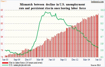
When the current U.S. recovery began in the middle of 2009, the ‘not in labor force’ category stood at 81.4 million, and it kept rising. In June, it expanded by 640,000 to 93.6 million. Interestingly, the June surge came on the back of what at the time was a 280,000 print in non-farm payroll in May. You would think that would have enticed many to enter the labor force. It did not.
Now we know that May was not as strong as previously thought. It was revised lower by 60k, and April was revised lower by 34k. June saw an addition of 223,000 jobs – decent, but not a home run. And that has been the case throughout the expansion. Probably the reason why the red bars in Chart 1 have been persistently rising.
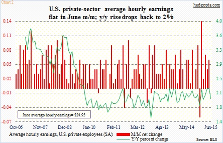
If we just focus on the green line in Chart 1, it is hard to come to grips with Chart 2. Average hourly earnings for private-sector employees remained unchanged at $24.95 in June. The real story lies in the green line in Chart 2, which in the current expansion is yet to grow with a three handle. One look at those red bars in Chart 1, and we know why. The labor market is not as tight as represented by the unemployment rate. One primary reason why the green line in Chart 1 is as low is because the red bars are as high as they are.
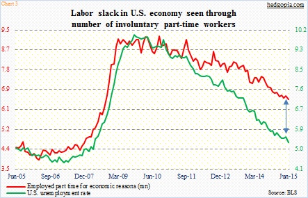
There is slack. Chart 3 does a good job of highlighting it. The green and red lines normally move together. This time around, even though directionally they are moving in tandem, but the gap is wide. There are 6.5 million part-time workers who do so involuntarily.
This probably gives the Fed plenty of wiggle room to again move the goal post, should it so choose.
Thanks for reading!

