- Should not come as a shock that wage growth for U.S. workers is in doldrums
- Beneath ‘all hunky dory’ headlines, there are cracks in labor market
- In corporate vs. labor today, former price setter, latter taker
The five-cent month-over-month drop (to $24.57) in the average hourly earnings of U.S. private employees in December has caused shock waves! Should it?
Year-over-year, growth did indeed slow to 1.7 percent, the slowest pace since the 1.5 percent rise in October 2012. Chart 1 clearly shows a decelerating trend that has been going on for some time. For over five years now, y/y growth has struggled to sustainably stay above two percent.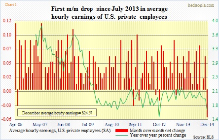
For some perspective, back in July 2013, the last time hourly earnings fell m/m (by a penny, to $23.97), the unemployment rate was 7.3 percent. Now it is 5.6 percent. Since then, an additional 3.8mn private-sector jobs have been created. The labor market has to have tightened. Why is this not getting translated into upward pressure on hourly earnings?
First of all, to repeat the hackneyed phrase, one month does not make a trend. This could easily reverse in January or later. Last year, there were six months in which average earnings rose by five cents or more (January, February, May, June, August and November).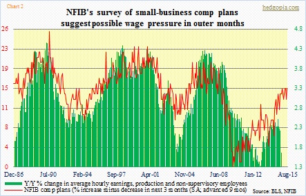
Secondly, average weekly earnings, tracking average weekly hours, rose faster in December (not shown here). This may be due to use of more overtime hours. But if it sustains, this could mean budding wage pressure. National Federation of Independent Business members have been expecting this for a while. Chart 2 plots their comp plans with actual y/y percent change in hourly earnings, and the variables track each other well. Even though the red line finds itself much lower than in previous recoveries, the green line can catch up. At least that is the hope.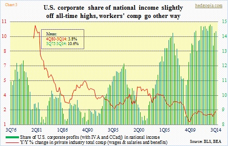
Third, the ECI (employment cost index), which tracks wages, fringe benefits as well as bonuses, has been diverging, albeit slightly. Long-term, the trend is similar, but unlike in Chart 1, where the green line has gone sideways/down in the current recovery, the red line in Chart 3 bottomed in 4Q09 and has been trending higher.
For this trend to continue, the green bars in Chart 3 need to shrink. On Friday evening, CNBC host Jim Cramer said the wages situation was bad for workers because profits were only going to flow to the bottom line of companies rather than to the workers. He is an investor. It should not surprise us that he feels that way. But for a company, stakeholders include investors, customers, and, of course, employees. For a while now, the latter’s share in national income has been under pressure, even as the share of corporate profits is near all-time highs.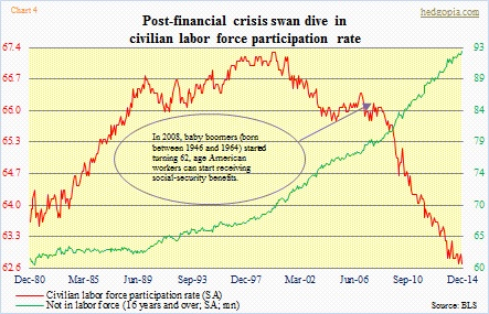
Corporations are doing it because they can. It is as simple as that. The labor supply/demand dynamics clearly are in their favor. Here are a few numbers to drive the point home. In November 2007, right before Great Recession began, the U.S. unemployment rate was 4.7 percent, now it is 5.6. The employment-to-population rate was 62.9 percent, versus 59.2 now. The ‘not in labor force (16 years and over)’ category consisted of 79.1mn back then, and 92.9mn now. The U.S. population has grown by nearly 17mn between the periods. There were 121.9mn full-time employees back then, two million more than what we have now. Last but not the least, the civilian labor force participation rate has shrunk from 66 percent to 62.7 (Chart 4).
This is not conducive to a situation in which a worker can put the foot down and ask for a raise. After a massive November, which saw the addition of 353k non-farm jobs (345k private), one would have hoped the labor force would expand, tempting some of the discouraged to enter the labor force. Did not happen. The civilian labor force shrank by 273k in December.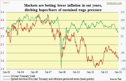
The point is, no matter what the headline number, beneath the surface there are problems, and corporations know it. They set the price. Labor is a price taker in today’s context. The markets know it too. The latter is clearly betting that low inflation is here to stay for at least the next several years (Chart 5). By default, they have also priced in low wage pressure.
Hence the rhetorical question in the opening paragraph “Should it?” Given the circumstances, should we be surprised at all that wages are not rising? Is not that what the bond market is telling us (Chart 5)? In the corporate vs. labor saga, the outlook is somber for the latter. Here is a chart to brighten up the mood a little.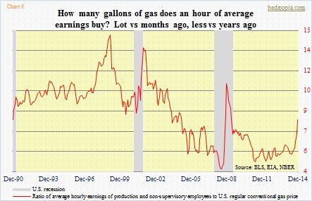
Chart 6 essentially tells us how many gallons of gas an hour of work buys. As can be expected, since June last year, it has had a nice move to the upside. A stealth wage increase!

