
Except for the Nasdaq composite, major U.S. indices – the S&P 500 large cap index, Russell 2000 small cap index, Dow Industrials, and the NYSE composite – all had a down March. This did not stop NYSE margin debt from rising 1.7 percent month-over-month to $536.9 billion – a new all-time high.
These indices all rallied in April. So it is possible margin debt rose further.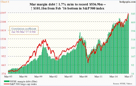
Chart 1 shows the close relationship between margin debt and the S&P 500, which rallied 0.9 percent in April.
Previously, margin debt peaked in April 2015 at $507.2 billion, followed by a peak in the S&P 500 a month later. The latter reached a major bottom in February last year, as did margin debt. Since that bottom, $101.1 billion in debt has been added, and the S&P 500 from intraday low to high rallied nearly 33 percent.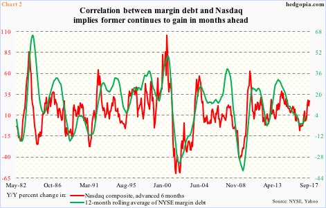
For whatever it is worth, if the relationship between the variables in Chart 2 holds, margin debt is slated to rise further.
In the chart, year-over-year change in the Nasdaq composite is pitted against margin debt. The former is advanced by six months, and the latter uses a 12-month rolling average. On this basis, margin debt was $487.8 billion in March – a new high – and after dropping for nine consecutive months, February and March were positive y/y.
Accordingly, the green line has hooked up, following the red line higher, and may have further to run in the months ahead, provided the relationship holds.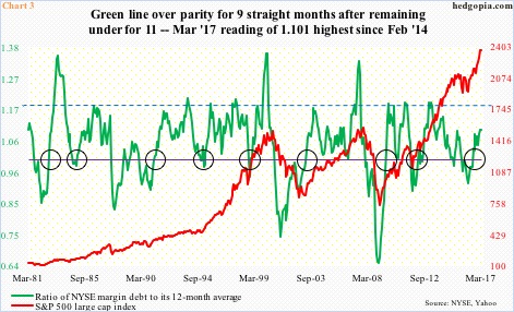
In this scenario, the green line in Chart 3 has room to rise.
The line represents a ratio of margin debt to its 12-month average. For instance, in March it came in at 1.101 ($536.9bn/$487.8bn). The circles in the chart represent the times when the ratio rose from below one toward resistance drawn at 1.179 (blue dashed line).
Of course, there have been times the ratio continued higher well beyond that blue dashed line – the three major peaks represent June ’83, February ’00 and June ’07. The latter two in particular were major peaks.
As things stand, the green line can rise – at least toward the blue dashed line. In fact, as noted above, margin debt possibly rose further in April. We will find out when it is reported in a month. (Incidentally, the ratio bottomed in February last year at 0.919.)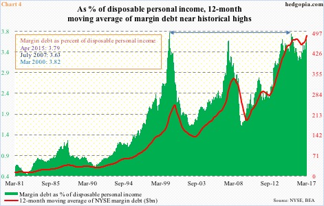
Now comes the interesting part.
Assuming margin debt continues higher, we can just imagine what Charts 4 and 5 would look like. Both of them are already at stretched levels.
Take Chart 4. The green bars represent margin debt as percent of U.S. disposable personal income. The latter was $14.4 trillion in February, so margin debt comprised 3.67 percent in that month. (March personal income numbers are reported later this morning.)
The 3.67 percent in February is below 3.79 percent in April 2015 but is higher than the high in July 2007. The all-time high was recorded in March 2000. Both 2000 and 2007 saw major peaks in stocks.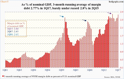
Chart 5 is the same away.
Three-month running average of NYSE margin debt is used in calculation of share in U.S. nominal GDP. The latter was $19 trillion in 1Q17 and the former $526.1 billion, thus 2.77 percent, which is what the red bars represent.
The 1Q17 total is barely under the all-time high 2.8 percent reached in 2Q15, and is already past the peaks of 1Q00 and 2Q07. (Do keep in mind that in April ’15 margin debt reached $507.2 billion before retreating and which was not surpassed until January this year.)
Both Charts 4 and 5 are testament to how elevated margin debt already is. Does not mean it cannot continue higher. But with each push higher, reversal risks rise. And when that happens – as we saw in 2000 and 2007 – it can come under massive pressure, taking stocks along with it.
Thanks for reading!
