
The financial accounts of the U.S. for 2Q17 was published last Thursday. Better known as the Z.1 report, the massive quarterly publication contains tons of useful data – thus highly recommended.
The seven charts below try to highlight where things are headed the right – or, for that matter, wrong – direction.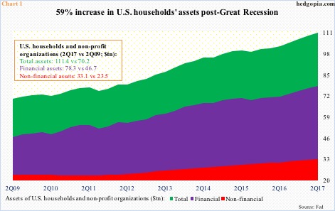
First the good news.
U.S. household assets reached a new high (Chart 1). At $111.4 trillion, 2Q17 represents an increase of $41.2 trillion in the current recovery, for a rise of 58.7 percent. Great Recession ended June 2009.
Breaking total assets into financial and non-financial, the former jumped 67.7 percent between 2Q09 and 2Q17, and the latter 40.8 percent.
The larger growth in financial assets primarily owes to households’ equity ownership (corporate equities and mutual fund shares), which went from $9.1 trillion to $24.9 trillion, for a surge of 173.4 percent.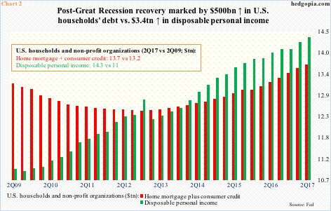
During the period, household debt (home mortgage plus consumer credit) went up, but only by $494.3 billion (Chart 2).
In fact, at least looking through the lens of disposable personal income, the growth in household debt does not look egregious, with the former outpacing the latter since 1Q14.
Here is the rub, though.
The improvement in household debt – if we can call that – is primarily due to home mortgage, which declined from a peak of $10.7 trillion in 2Q08 to $9.9 trillion in 2Q17. Consumer credit, however, went from $2.6 trillion in 2Q09 to $3.7 trillion in 2Q17, with student loans of $1.5 trillion, auto loans of $1.1 trillion and credit card loans of $955.2 billion.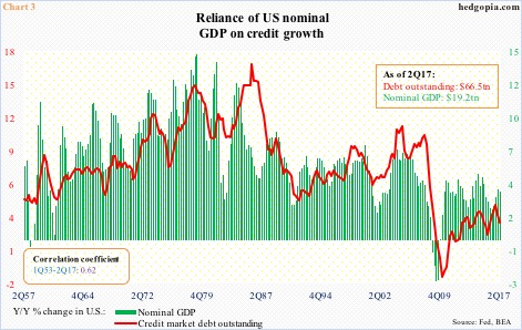
Said differently, debt reliance continues – be it on the government, corporate or individual level.
Chart 2 reflects this interdependence very well, with year-over-year change in U.S. credit market debt outstanding and nominal GDP moving hand in hand.
The ratio between the two was 3.45 in 2Q17 and has persistently risen over the years, particularly since the early ’80s. In 1Q80, it was 1.58.
It is increasingly taking more and more debt to produce the same output.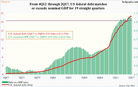
The federal government probably deserves the most blame here.
It already owes $20.2 trillion. Chart 4 uses 2Q17 data, and on this basis the debt-to-GDP ratio was 1.03. This was the 19th straight quarter of reading of one or above.
What has been the growth like in the current recovery?
Between 2Q09 and 2Q17, federal debt went from $11.5 trillion to $19.8 trillion! With a trajectory like this, and the government unable to get a handle on the budget, this metric is not on a sustainable path.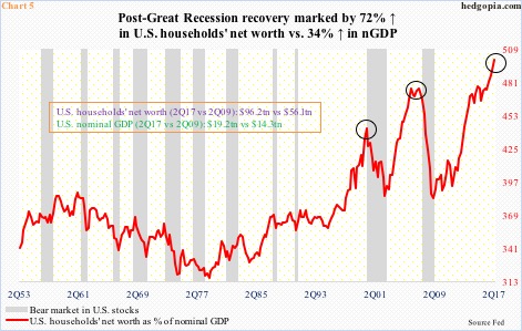
Speaking of unsustainable, take a look at Chart 5, which plots households’ net worth as a percent of nominal GDP.
In the current recovery, households’ net worth jumped 71.6 percent to $96.2 trillion. Contrast this with a 34.2-percent rise in nominal GDP to $19.2 trillion.
As a result, the red line in Chart 5 rose to a new high in 2Q17, with net worth making up nearly 500 percent of nominal GDP – higher than in 1Q00 and 1Q07. Both those peaks coincided or preceded the onset of a bear market in stocks.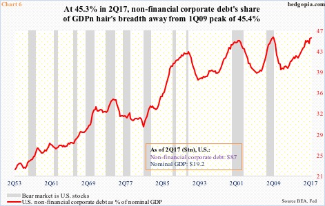
Or take Chart 6, for that matter.
The red line makes up U.S. non-financial corporate debt as a percent of nominal GDP. In 2Q17, corporate debt stood at $8.7 trillion, up from $6.5 trillion in 2Q09.
The steady rise in leverage brings 2Q17 within a hair’s breadth away from the prior high – 45.3 percent versus 45.4 percent in 1Q09.
During both 2000-2002 and 2007-2009 bear markets, this metric peaked midway through the downturn.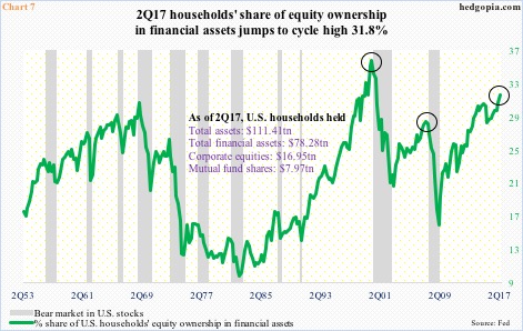
Households’ equity ownership, however, has shown a tendency to lead.
The green line in Chart 7 is the percent share of households’ equity holdings in financial assets. As noted above, they held $24.9 trillion in stocks and mutual funds in 2Q17. This comprised 31.8 percent of households’ financial assets – in uncharted territory. The only time this metric was higher was during the dot-com bubble when it peaked at 36 percent in 1Q00.
In both 2000 and 2007, the green line either led or was coincident with the onset of a bear market. After a brief decline, it has been rising since 4Q15. Equity bulls obviously hope this continues. But with each push higher, the risk of a reversal – also known as a bear market – grows.
Thanks for reading!
