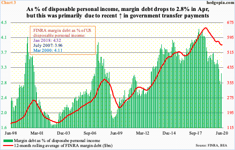
Between March and June, FINRA margin debt increased $105.4 billion, providing a nice tailwind for stocks. As a percent of disposable personal income, margin debt dropped to 2.8 percent in April, down from 4.3 percent in January 2018. Historically, peak-to-trough drops have been steeper. Secondly, April’s reading is artificial in that government transfer payments boosted income in that month.

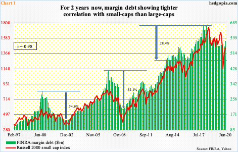
One of the hallmarks in US stocks for a while now is a lack of aggressive risk-on attitude seen through margin debt. FINRA margin debt peaked as far back as May 2018 at $668.9 billion. The Russell 2000 small cap index, which is another vehicle used in risk-on mode, peaked in August that year. Going back to January 1997, the Russell 2000 and FINRA margin debt have a correlation coefficient of 0.98 (Chart 1).
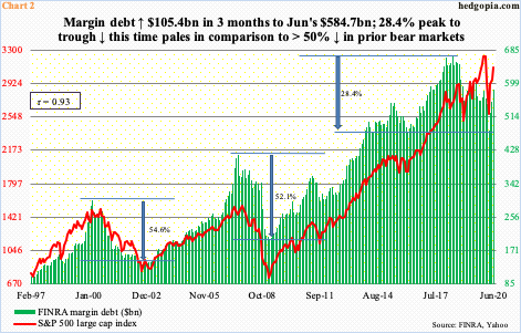
In contrast, the correlation coefficient with the S&P 500 large cap index over the same time period is 0.93 (Chart 2). Understandably so, considering margin debt is in divergence with large-cap stocks. In contrast to the Russell 2000 which peaked nearly two years ago, the S&P 500 only peaked this February. The Nasdaq composite peaked merely six sessions ago and the Nasdaq 100 12 sessions ago.

After a sharp selloff in February and March, all these indices bottomed in the fourth week of March. As did margin debt, which did so at $479.3 billion in that month.
From the March low, equities rallied massively, with full cooperation from margin debt. From the March low, margin debt grew 22 percent to June’s 11-month high $584.7 billion. July-to-date, stocks have continued to rally, although at varying degrees depending on the index. With three more sessions to go this month, the Nasdaq 100 is up 3.7 percent and the S&P 500 3.8 percent, while the Russell 2000 is lagging with a two percent rise.
So, if margin debt continues to correlate tighter with small-caps than large-caps, it likely is on course for a rise this month but in moderation. For investors, more important perhaps is where it might be headed in months to come.

At least in terms of disposable personal income, use of margin debt is not looking as excessive as in the past. Chart 3 presents margin debt as a percent of disposable personal income (DPI), which is the amount of money available to spend or save after taxes have been paid for.
In May, margin debt made up 3.1 percent of DPI, up from 2.8 percent in April. (June’s personal income/spending data is due out Friday.) The metric has been under pressure since peaking at 4.3 percent in January 2018. The prior two cycles, too, peaked at four percent or slightly higher – 4.1 percent in March 2000 and four percent in July 2007.
However, a couple of things need consideration here.
One, in the prior two cycles, the metric went much lower before bottoming – 1.7 percent in September 2002 and 1.9 percent in February 2009. As a reminder, the S&P 500 ended its bear markets back then in October 2002 and March 2009. From this angle, should history repeat itself, the green bars in the chart have room to head a lot lower.
Two, April’s 2.8 percent is artificially suppressed. DPI was $18.7 trillion in that month, up from $16.5 trillion in March. The 13.1-percent jump was boosted by government transfer payments – $1,200 that millions of households received from the federal government and $600 in additional weekly unemployment benefits. This is transitory. Using March’s DPI, margin debt would have accounted for 3.2 percent in April.
With all that said, the fact remains that the prevailing trend until March, with 2.9 percent, was decidedly down. It is just that the metric probably is not done going down. Also, in the prior two cycles, from peak to trough margin debt dropped in the 50 percent range – 54.6 percent and 52.1 percent, respectively. This time around, from May 2018 to March this year, it only dropped 28.4 percent (Chart 2). Unless it is different this time, margin debt in all probability has not seen its low.
Thanks for reading!

