
The Fed’s dual mandate currently is a source of ammo for both hawks and doves within the FOMC. Would it always remain this way?
Core PCE inflation has been ticking up a bit of late, but still below the Fed’s two-percent goal. On an annual basis, February rose at 1.68 percent, rising from 1.26 percent last July. The last time this measure of inflation – the Fed’s favorite – rose at two percent annually was in April 2012.
The rather subdued inflation – although showing some life in recent months – favors’ the dovish argument.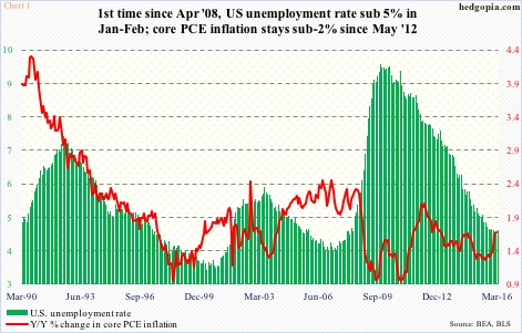
Then we have employment, where the unemployment rate dropped from 10 percent in October 2009 to sub-five percent in January and February (Chart 1). Nearly 13 million non-farm jobs have been added during the recovery.
The progress in employment is not without holes. The ‘not in labor force’ category, for instance, has gone up from 80.9 million in June 2009 to 93.5 million now – one primary reason why the unemployment rate has come down as much.
That said, employment has come a long way – obvious fodder for FOMC hawks to question the need to continue with zero interest-rate policy.
As things stand now, employment should continue to favor the hawks. Although some chinks in its armor are appearing.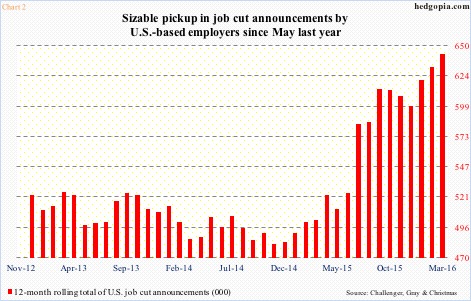
Chart 2 plots a 12-month rolling total of U.S. job cut announcements (compiled by Challenger, Gray, & Christmas). The trend is clearly up. In fact, after a May 2015 trough, the red bars have nearly gone parabolic.
Last month, the 12-month total stood at 643,216. This was probably unduly influenced by the unusually high 105,696 job cuts announced last July, but even if we normalize those cuts and cut in half, March’s 12-month total still rises to a high of 590,368; it is just that the slope of the red line will be less steep.
The good thing is, this has not yet resulted in upward pressure on unemployment insurance claims.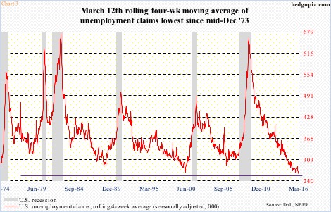
Chart 3 plots a rolling four-week average of these claims (seasonally adjusted). In the week ended March 12th, they dropped to 259,500 – the lowest since mid-December 1973. In the following couple of weeks, they inched higher, to 263,250. The same way weekly claims have been rising since troughing at 253,000 four weeks ago; by March 26th, they reached 276,000.
Claims are low. But are things too good to be true? Chart 3 also shows that each time the red line drops below 300,000, sooner or later, it tends to rise. 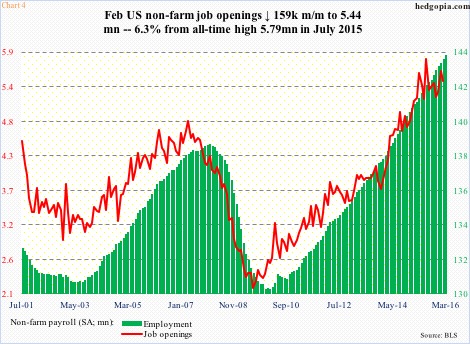
Thus far, non-farm payroll has shown momentum, rising at about two percent annually. Job openings, however, which tend to lead, are showing a flattish tendency the past several months. Openings peaked last July at a seasonally adjusted annual rate of 5.79 million, with February at 5.44 million (Chart 4).
Chart 5, too, uses the JOLTS report. There are more and more openings per unemployed – healthy, of course. However, the ‘quits’ number may be trying to tell us something. People quit jobs when they are certain they will find a new one in no time.
‘Quits’ were 3.09 million in December, which then dropped to 2.85 million in January and to 2.95 million in February. The quits-to-hires ratio moved lower, from 0.57 to 0.54 in February.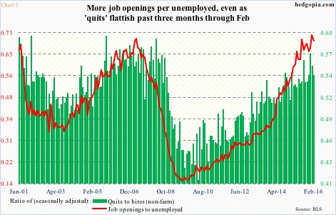
To be clear, all this may amount to nothing. Or, this may just be the beginning of something. We will just have to wait and see.
Given the maturity of the cycle, it is perhaps prudent to stay open to the possibility of weakness down the road. In this scenario, hawks would have lost a reliable tool. Victory to the doves!
Thanks for reading!
