
The bull market in U.S. stocks is nine years old. While this alone does not necessarily sound the death knell for this aging bull, this is not a time to remain unambiguously sanguine either.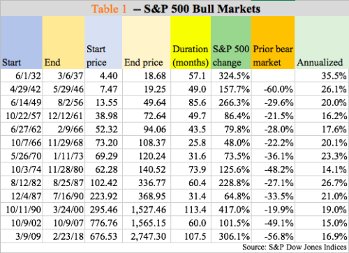
Last Friday, the bull turned nine, and – hopefully for the bulls – counting. On March 9, 2009, after collapsing 58 percent from the October 2007 high of 1576.09, the S&P 500 large cap index bottomed at 666.79. On January 26 this year, it retreated after hitting 2872.87. Too soon to say if this is a peak or the peak.
After a swift correction early February this year, stocks have mounted an impressive rally. The Nasdaq composite, in fact, has rallied to a new high. The S&P 500, however, is still 3.2 percent from its January high.
Since that generational low, the bulls have had quite a ride. At 108 months, the current bull market is the second longest after the October 1990-March 2000 record that lasted 113.4 months (Table 1).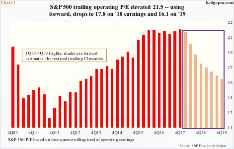
Multiples, of course, have followed higher, and they are not cheap.
In fact, on a trailing 12-month basis, the operating price-to-earnings ratio for S&P 500 companies stood at an elevated 21.5x. The picture changes if we use forward estimates. But these are exactly that – estimates. At least going by how the revision trend evolved the last several years, in the end, these companies came up substantially short of sell-side estimates.
For instance, 2017 operating earnings estimates in January 2016 were $141.11. With 4Q results just about done, 2017 as of last Thursday is on pace for $124.64. Similarly, $106.26 was earned in 2016, versus estimates of $137.46 in February 2015.
Post-December 22, 2017 tax cuts, estimates for this year and next have gone through the roof, with 2018 currently at $156.43 and 2019 at $172.50. If – big IF – these estimates come through, multiples obviously contract. Even here, 2019 is north of 16x (Chart 1).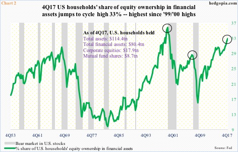
The elevated nature of these multiples is reflected in several other metrics.
The Fed’s Z.1 report for 4Q17 came out last week. (It contains a treasure trove of information, spanning all forms of government, households and corporations – highly recommended).
Chart 2 highlights public ownership of stocks. Last quarter, U.S. households’ equity ownership in financial assets rose to 33 percent, much higher than the 2Q07 high of 28.9 percent but still below the 1Q00 peak of 36.1 percent. Now one can argue that there is still room for this metric to continue higher, as it did during the 1999/2000 bubble, which it very well could, but the thing to remember here is that things are getting stretched.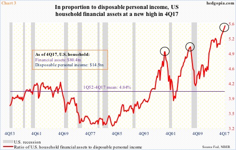
Staying with households, Chart 3 and 4 send a similar message.
In the current recovery, households’ financial assets rose from $46.5 trillion in 2Q09 to $80.4 trillion and disposable personal income from $11 trillion to $14.5 trillion – for respective growth of 73 percent and 32.4 percent. This lopsided growth in financial assets is reflected in Chart 3. Last quarter, the ratio between the two rose to 5.53 – a new high. The average going back all the way to 1Q52 is just north of four.
At least in the prior two cycles, the ratio peaked much lower, and that a peak in the red line, followed by sustained pressure, preceded a recession.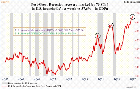
There has been a similar lopsided increase in households’ net worth, which jumped from $55.9 trillion in 2Q09 to $98.7 trillion, up 76.8 percent. In and of itself, this is great. On the surface, with this kind of net worth, households are sitting pretty. But a deeper look also reveals the dangerous trajectory the buildup is on. During the period, nominal GDP only rose from $14.3 trillion to $19.7 trillion, for growth of 37.6 percent. The red line, which measures households’ net worth as a percent of nominal GDP, is on an unsustainable path.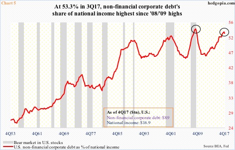
Speaking of unsustainable, take a look at Chart 5, which plots non-financial corporate debt as a percent of national income.
In 4Q17, corporate debt stood at $8.9 trillion, up $2.5 trillion in the current cycle. This made up 52.9 percent of national income ($16.9 trillion in 4Q17), down slightly from 53.3 percent in 3Q17. The question is, was the 3Q17 peak a blip or the beginning of a trend? For if it is the latter, judging by at least the last two cycles, it can go a lot lower. The red line also shows a tendency to peak after a bear market in equities has begun. So it is possible it has not peaked. Once it does, corporate debt can drop, as we saw the last time when it contracted from $6.6 trillion in 3Q08 to $6 trillion in 4Q10.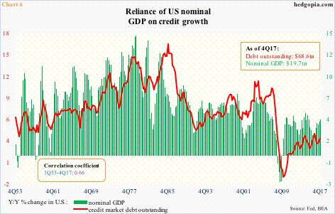
Therein lies the crux of the problem. Debt has simply become the economy’s oxygen. Just to throw out some numbers, between 2Q09 and 4Q17 – means the current recovery – household debt (home mortgage and consumer credit) went from $13.2 trillion to $13.9 trillion, non-financial corporate debt – as explained earlier – from $6.5 trillion to $8.9 trillion, and federal debt from $11.5 trillion to $20.6 trillion, among others.
Despite nearly nine years of economic recovery, leverage has continued to increase, as has the economy’s dependence on it. The correlation between nominal GDP and credit market debt outstanding is significant (Chart 6).
Hence the risk that lies ahead. Once a process of unwinding begins – whenever that is – it can last a while. We saw this in particularly the last two cycles. That said, none of the charts in these pages can be used for timing purposes. They merely show the excesses that are building in the system. The red line in Chart 3, for example, exceeded the 3Q07 high four years ago, and it is still rising. Except it for sure has not grown immune to the laws of gravity. Nor have the other charts.
Thanks for reading!
