
As of last Friday, only 32.6 percent of S&P 500 stocks were above 50-day moving average, earlier having dropped to 29.8 percent on Wednesday. This compares to 22 percent on June 27 (orange arrow in Chart 1) when the S&P 500 bottomed post-Brexit two-day decline.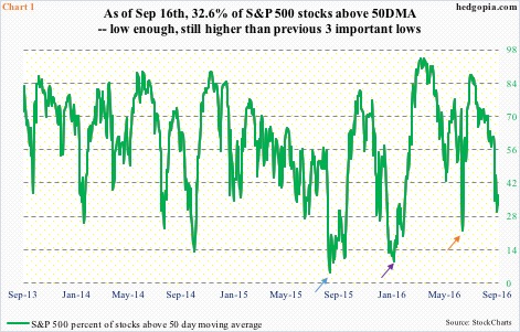
Historically, a drop into the 20s has signified a tradable bottom plenty of times. That said, there have been times the green line in Chart 1 has dropped into the low teens or even single digits. On January 20 this year, it collapsed to nine (indigo arrow). The S&P 500 bottomed on February 11. Similarly, on August 25 last year, it crashed to 4.6 (blue arrow). The index bottomed on August 24.
Whether or not the green line in Chart 1 continues lower or reverses higher likely depends on the following.
The S&P 500 (2139.16) had essentially been going sideways since February last year (arrow in Chart 2), peaking at 2134.72 in May that year. On July 12 this year, the index rallied past that high, then rallying another 2.7 percent to the new all-time high of 2193.81 on August 15.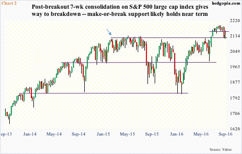
For seven or eight weeks post-July breakout, the index went sideways. Bulls were hoping this was part of a continuation pattern, which would ensure stocks would eventually break with the prior trend. Selling accelerated when the S&P 500 lost 2160 (long red candle in Chart 2). That is the bad side to this. The good is that buyers showed up last week near 2120. That was the number first hit in February last year.
If the bulls are not able to save 2120, selling likely accelerates again. This level probably holds tons of stops.
Help may come from this week’s FOMC meeting. After the July 26-27 meeting, several prominent FOMC members sought to prep the markets for a hike. But economic data has refused to go along. Markets do not expect the Fed to move this week. Stocks are oversold, which the bulls can potentially make use of to their advantage. All the better if Wednesday’s FOMC statement leans dovish.
Most data out since the July meeting point to weakness, not strength.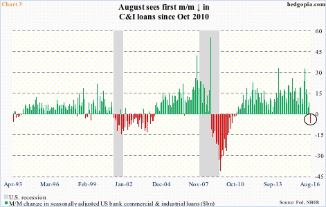
In August, U.S. banks’ commercial & industrial loans fell $6.5 billion month-over-month to a seasonally adjusted annual rate of $2.06 trillion. This is not a big deal in a larger scheme of things. Loans have come a long way since October 2010, when they bottomed at $1.18 trillion. They have since persistently grown. In fact, since that low, they have never had a down month – until this August, that is (circle in Chart 3). This is potentially important.
In the past, there have been several false signals, but successive m/m declines in C&I loans have tended to accompany recession, hence worth watching.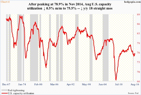
Continued contraction in loans likely means inventory build does not happen, which would in turn mean continuation of suppressed capacity utilization.
Rather interestingly this cycle, utilization failed to cross 80 before coming under pressure. It peaked at 78.9 percent in November 2014, then dropping all the way to 74.9 percent by March this year, before rising a tad. August was 75.5 percent.
Chart 4 reveals the tough spot the Fed is in. In the past, it began to tighten when utilization was rising. The 25-basis-point hike in December last year took place even as utilization was dropping. Just based on this chart, unless utilization begins to persistently rise – not a base case on this blog – it is awfully hard to argue for a persistently hawkish Fed.
Also not when corporate capital expenditures are the way they are.
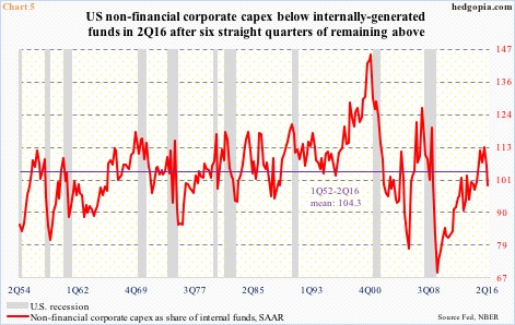
Non-financial corporate capex peaked in 2Q15 at a seasonally adjusted annual rate of $1.85 trillion, and has dropped in each quarter since, with 2Q16 at $1.65 trillion. Similarly, internally generated funds (profits before tax adjusted for inventory valuation and depreciation minus income taxes minus dividends paid plus depreciation) peaked at $1.75 trillion in 3Q14 … 2Q16 was $1.66 trillion.
In Chart 5, non-financial corporate capex is shown as a share of internal funds. For six quarters to 1Q15, the red line was in excess of 100 percent. In 2Q16, it dipped back below. It is dropping from a much lower level versus the prior two recessions.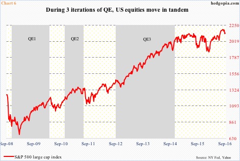
Importantly, this is a Fed that refuses to act like we are no longer in a crisis. They deserve a ton of praise for the way they responded to the financial crisis, but after seven years of economic growth, albeit sluggish, rates are still zero-bound. With several recent data sets pointing to weakness, they have ample excuse not to move.
That said, it is also awfully hard to continue to stimulate, especially when unconventional measures have not produced the desired outcome for the economy. After three iterations of quantitative easing, during which financial assets did very well (Chart 6), the Fed’s balance sheet is bloated. Elsewhere in Japan and the Eurozone, negative interest rates are not working, with question marks over the efficacy of purchases of corporate bonds. The odds of continued handout of monetary morphine are low.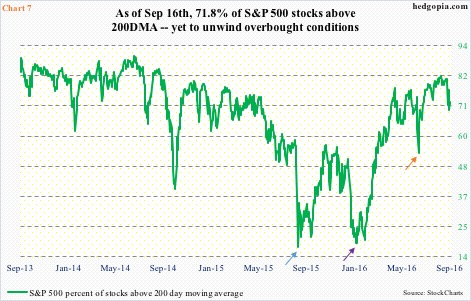
This likely dampens the medium-term outlook for stocks.
Not to mention the fact that the percent of S&P 500 stocks above 200-day moving average remains stubbornly high. Last Wednesday, it dropped to 69.4 percent, rising to 71.8 percent by Friday. This is much higher than the low on June 27, when it declined to 53.4 percent (orange arrow in Chart 7) – still high. Real washouts took place on Jan 20 this year and August 25 last year, when the green line dropped to the teens – 19.2 percent (indigo arrow) and 17.6 percent (blue arrow), respectively.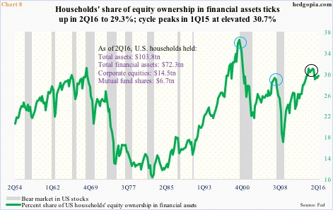
No washout in Chart 8 either. Far from it! As a matter of fact, the green line remains way elevated. It represents the share of equities in U.S. households’ financial assets. In 2Q16, this stood at 29.3 percent. The cycle peaked at 30.7 percent in 1Q15, which was the second highest after 36.1 percent in 1Q00 – higher than 28.9 percent in 2Q07. We know how those two peaks eventually ended (blue circles).
As things stand, immediately ahead the S&P 500 faces resistance in the 2160-2178 range, with the 50-day moving average at 2168. Weekly indicators remain overbought, but the index is oversold on a daily basis. Concurrently, spot VIX, having spiked to 20.51 last Monday, is looking to go lower. Stocks’ path of least resistance is up near term … although medium term, the outlook is anything but.
Thanks for reading!
