
Equity bulls are putting down their foot, and have near-term momentum on their side so long as 2040 on the S&P 500 is not lost.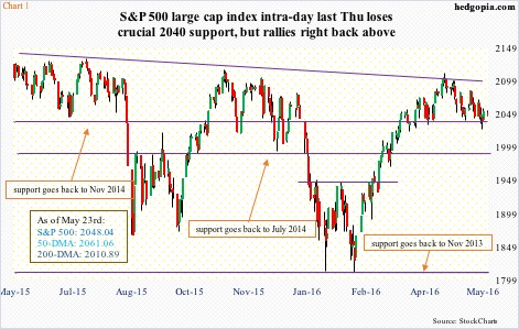
Off the April 20th high through last Thursday’s intra-day low, the S&P 500 lost four percent, before hammering out a hammer reversal. Support at 2040 was defended. This is not any other support… goes back to November 2014 (Chart 1). This also retraces 23.6 percent of the February 11th-April 20th 300-point rally. This is a Fibonacci sequence, and is closely watched by so-inclined technicians.
Bulls would love to build on last week’s price action. Given oversold daily conditions, stocks have room to rally near term.
During the one-month slide in the S&P 500, spot VIX rallied past 17 twice – April 29th and May 19th. On both occasions, VIX reversed hard (arrows in Chart 2). The 16-17 range has been an important line in the sand, going back some two decades. In the past, convincing breakouts have led to sharp rallies in the volatility index.
This time around, the spike last Thursday resulted in a gravestone doji – potentially bearish near-term. This also came right outside the upper Bollinger Band. Near-term, VIX can continue to unwind its daily overbought conditions.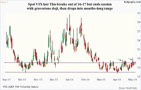
Financials fared well last week, with XLF, the SPDR financials ETF, up 1.4 percent, after three down weeks. Talk of a possible hike in fed funds in June drew traders into the ETF. After three FOMC members’ hawkish speeches in the prior week, three more – Jeffrey Lacker (Richmond), John Williams (San Francisco), and Dennis Lockhart (Atlanta) – said last week that two to three rate increases this year were possible. Markets expect one.
Plus, FOMC minutes for the April 26-27 meeting, released Wednesday, leaned hawkish. The two-year yield – most sensitive to Fed action – shot up to 0.9 percent in that session, up from a low of 0.72 percent in the prior week, and the 10-year to 1.87 percent, up from 1.71 percent.
That said, the 10-2 spread is the lowest since late-November 2007 lows, even though the green bars in Chart 3 have gotten taller the past couple of weeks. It is perhaps markets’ way of saying the Fed is likely to hike, and should that occur, that would only end up hurting the economy.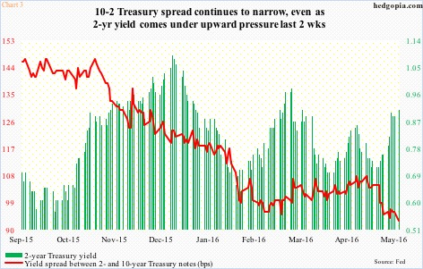
Here is the irony.
For the first time time in nearly a decade last December, the Fed raised the fed funds rate to a range of 0.25-0.5 percent – still near historical lows. Capacity utilization stood at 75.4 percent back then. Four months later, in April, utilization was unchanged – and lower than the cycle high 78.9 percent in December 2014. It is not often the Fed hikes when utilization has already peaked and is in decline (Chart 4).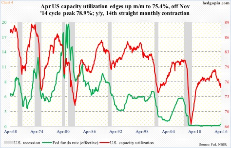
The truth is, the Fed has its back against the wall. It needs to fill its empty monetary quiver with arrows, but fundamentals are far from cooperating. If rates go up, this would take place at a time when high-yield bond issuance – a sign of risk-on – is in decline.
U.S. corporations have been issuing bonds hand over fist. In the seven years from 2009 through 2015, $8.7 trillion was issued, $6.8 trillion in investment-grade and $1.9 trillion in high-yield.
This year – annualized using January-April numbers – is on pace for another record year. High-yield is different – likely headed for its third consecutive down year (Chart 5).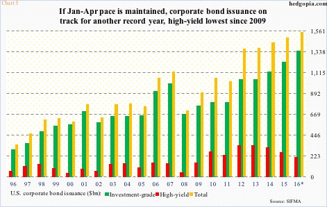
Here is the kicker.
Moody’s pointed out last Friday how U.S. corporate debt loads are expanding faster than cash holdings. Turns out there is $1.68 trillion of cash on these corporations’ balance sheets – not enough to cover the $1.8 trillion of debt that is coming due in the next five years. There is a clear mismatch between how fast debt load is rising versus how fast cash is coming in.
Is it any wonder stocks act confused? As if the persistently decelerating trend in corporate earnings was not enough of a worry, they are now having to worry about potentially higher rates – higher than currently priced in.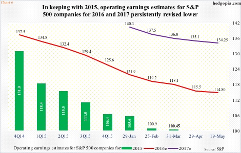
It has been a while since earnings were a tailwind, not a headwind. The revision trend is clearly down… has been that way for a while.
To recall, 2015 operating earnings estimates for S&P 500 companies were $137.50 at the end of 2Q14; actual earnings came in at $100.45. Along the same lines, at the end of 4Q14, 2016 estimates were $137.50, which have now been revised down to $114.80. Ditto with 2017, which started out at $141.11 in the middle of January this year; as of May 19th, this has now been cut to still-very-rosy $134.25 (Chart 6).
With multiples not in favor, the S&P 500 has essentially gone sideways one whole year. It peaked last May at 2134.72. On April 20th this year, at 2111.05 it came within 1.1 percent of that peak, before turning down. The all-time high of last May stands.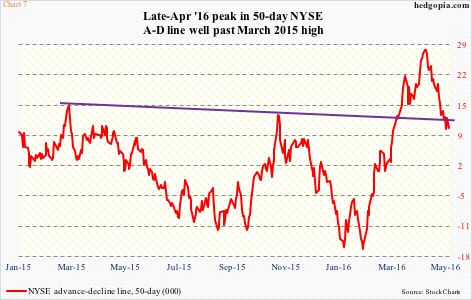
The rally off of February 11th lows looks strong on the surface, but a deeper look reveals something else.
The regular version of NYSE advance-decline line, which is most often quoted, peaked in March last year (Chart 7). The S&P 500 peaked in May that year. This April, it made a new high. Although the S&P 500 was still below the May 2015 peak, a new high in the NYSE A-D line was – and should be – hailed as positive. Scratch under the surface, and the picture looks different.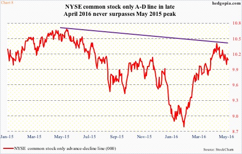
Chart 8 plots the NYSE common stock only A-D line. Unlike in Chart 7, the late-April high was below the May 2015 high. Once again, Chart 8 only represents common stocks, not preferreds or bonds, among others. The failure to reach a new high can be interpreted as a sign of underlying weakness.
This is probably the reason why the medium-term outlook for the S&P 500 is still down – as the index proceeds to unwind its weekly overbought conditions. In the near term, though, bulls have room to push it higher.
It is a different ball game, however, if the S&P 500 loses 2040.
Thanks for reading!
