Around the August lows in U.S. equities, several sentiment indicators looked washed out. For instance, the bulls’ count in Investors Intelligence’s survey dropped to 24.7 percent in the September 29th week – the lowest since late December 2008 (although bears only rose to 35.1 percent).
Similarly, National Association of Active Investment Managers (NAAIM) members’ exposure to U.S. stock markets declined to 16.4 percent in the September 30th week. This was the lowest since the middle of October last year when it dropped to 10 percent (Chart 1). We know what followed back then. The S&P 500 went on to rally 17 percent in the next seven months.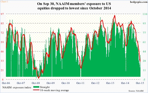
There was a similar extreme low reading in 2011, when the S&P 500 index dropped 21 percent in five months, before bottoming out in October. The NAAIM index dropped to four by late September that year. Once again, that proved to be a major low. From that low, the S&P 500 nearly doubled, before peaking this past May.
Could the recent low in NAAIM reading prove to be as lucrative for the bulls? Several commentators have been comparing what transpired in August-September this year to the October low in 2011, suggesting a major low has just been made.
But is it really that simple? It pays to go contrarian at extremes. But is this the only variable that matters? Here to help find some answers are comparisons using various metrics between how things stand now and how they stood in 2011.
It helps to put things into perspective.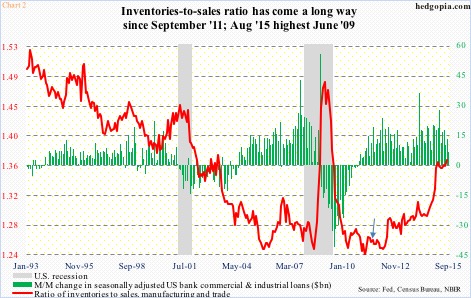
Post-Great Recession, commercial & industrial loans of U.S. banks bottomed at $1.18 trillion in October 2010, rising to $1.27 trillion by September 2011. The ratio of inventories to sales stood at 1.26 back then. By this August, the ratio had risen to 1.37. And by this September, C&I loans stood at $1.91 trillion. There are tons of inventories lying idle in the system. Not so in 2011 (arrow in Chart 2). Even if we assume a scenario in which end-demand begins to substantially firm up – not a base case on this blog – the existing inventories first need to be consumed (or written off) before another inventory cycle is set in motion.
Why is this important?
If for no other reason than earnings are in serious deceleration. The four-quarter rolling average of 2015 operating earnings of S&P 500 companies peaked at $114.51 in 3Q14. Four quarters later, they were $107.48. As of October 14th, estimates for this year have been revised downward to $110.80, down from $137.50 at the end of 2Q14. Early this year, 2016 estimates stood at exactly that level – $137.50 – and have now been revised downward to $127.88. This has an impact on valuations.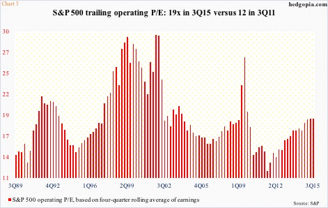
On a trailing 12-month basis, the price-to-earnings ratio on S&P 500 companies on an operating level stood at 18.8 times in 3Q15 (based on quarter-end price of 1920) – the highest since 19.6x in 4Q09 (Chart 3). The P/E ratio back then was elevated as earnings were suppressed (3Q09 was 26.9x). As earnings began to stabilize, so did stocks. Then came the 20-plus-percent decline in the S&P 500 in 2011. When stocks bottomed in October, the trailing P/E was 12x at the end of the third quarter. At the end of the third quarter this year (the index dropped 12.5 percent from high to low), the P/E was just under 19 – well above average.
That is the difference between 2011 and 2015. This time around, the valuation argument is out the window. The bull market is mature – in its seventh year. In 2011, it was just two years old.
This is also true with the economy. The Great Recession ended in June 2009. The subsequent recovery has been sub-par, no doubt, but it is a recovery nonetheless. With that said, signs of wear and tear are beginning to show up.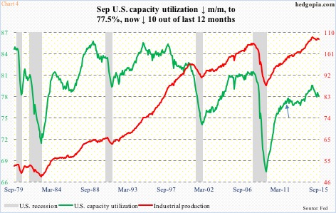
U.S. capacity utilization bottomed at 66.9 in June 2009, and started rising, reaching 76.4 percent in September 2011 (arrow in Chart 4). It continued rising, until it peaked at 79 percent last November. Utilization has been under pressure since that cycle peak – a sign of weakening momentum in the economy. Despite the latest drop, September, at 77.5 percent, was more than a point higher than four years ago. There was room to grow in 2011 – a total opposite of what is occurring now.
This is probably what has emboldened the shorts.
At the end of September, NYSE Group short interest rose to the highest since the all-time high in July 2008 – 18.45 billion shares now versus 18.61 billion back then (Chart 5). On the Nasdaq composite, the ascent is not as parabolic, but it has been trending higher (shown here).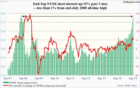
In a rather odd manner, the elevated level of short interest can potentially turn into a tailwind for stocks – with emphasis on the word ‘potential’. Remember the mid-October low in stocks last year? Back then, NYSE short interest stood at 15.79 billion shares, which then dropped to 14.93 billion by late December. Shorts got squeezed. Incidentally, at the end of September 2011, NYSE short interest stood at 16.09 billion shares, which dropped to 12.52 billion in the next four months.
This is what the bulls are hoping for.
For this to come to fruition, money flows need to improve. In the last six weeks ended last Wednesday, there have been $12 billion in outflows from U.S.-based equity funds (courtesy of Lipper), even though stocks have rallied. Not to mention NYSE margin debt that has come under pressure of late.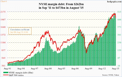
By August, margin debt had declined $33.7 billion from the April 2015 all-time high of $507.2 billion (perhaps not by chance, the S&P 500 peaked in May). Between January 1980 and August 2015, the correlation coefficient between the two variables was near-perfect 0.96. Hence its significance.
Back in September 2011, margin debt stood at $262.1 billion, with room to grow (Chart 6). Now it seems to be going the other way – essentially coming under its own weight. It was a tailwind in 2011, not so now.
Thanks for reading!

