
- Sideways move in stocks – just a pause or sign of fatigue after six-year run?
- Several different measures point to gradual buildup in complacency over the years
- Human nature not to want to leave party early, which is fine unless one is left holding bag
U.S. stocks are stalling.
The S&P 500 large cap index has gone sideways since last November. Ditto with the Dow Industrials. The NYSE Composite has been treading water since last June, and the Nasdaq Composite for the past two months. Some are acting weaker. For instance, the Dow Transports, which is also near crucial support. Financials act tentative.
Bulls obviously hope that this is the pause that refreshes itself. In fact, should these indices break out of this congestion, this has the potential to be a big positive, given the length of the consolidation.
But the bigger question perhaps is, might there be other reasons why things are stuck in the mud?
Is it because QE has come to an end? Is it because the bull market is aging? Is it because investor sentiment is already profusely bullish? Is it because earnings growth is in serious deceleration? Is it because the economy has stumbled? Is it because valuations are no longer as attractive as they were just a couple of years ago?
The charts below can help us get perspective on things, as to how things were in the past and how they are now. History does not repeat itself, but it can rhyme, and often does.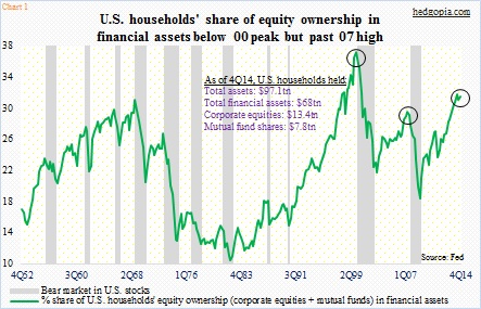
Chart 1 seeks to highlight the extent to which U.S. households are exposed to stocks. By 4Q14, they had $68 trillion in financial assets, $21.2 trillion of which was in equities (corporate equities and mutual fund shares combined). Back in 1Q09, these amounts were $45.1 trillion and $8.1 trillion, respectively. As a result, equities’ share in financial assets jumped to 31.1 percent in 4Q14 (was 31.4 percent in 2Q14), versus the all-time high of 36.8 percent in 1Q00, and higher than the 2Q07 high of 29.1 percent.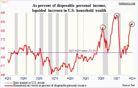
Along the same lines, Chart 2 focuses on the dynamics between households’ wealth and disposable personal income. Household net worth has witnessed a tremendous increase over the years – $82.9 trillion in 4Q14, versus $55 trillion in 1Q09. This is fantastic! The downside to this is that disposable personal income has struggled to catch up with it – $13.2 trillion in 4Q14, versus $10.9 trillion in 1Q09. This is what the chart shows. In 4Q14, household net worth was 6.3x disposable personal income, second only to the all-time high of 6.6x in 4Q06.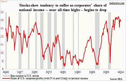
Any time things tilt heavy to one side, risks of imbalances grow.
The red line in Chart 3 represents U.S. corporate profits’ share in national income. In 4Q14, corporate profits (with inventory valuation and capital consumption adjustment) were $2.14 trillion, slightly below $2.17 trillion in the prior quarter, but more than double the $1 trillion in 4Q08. National income in the meantime has grown from $12.2 trillion to $15.3 trillion. Obviously, corporate profits have recovered much faster, resulting in the red line coming in at 14.6 percent in 3Q13. The last time it was this high was back in 4Q50. (It was 14 percent in 4Q14.)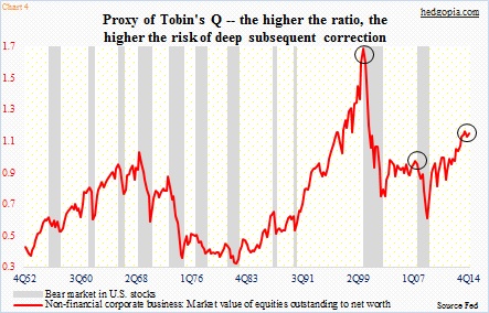
Tobin’s Q ratio is a valuation tool. James Tobin, its developer, hypothesized that companies’ market caps should be equal to their replacement costs (of the physical assets). A lower ratio means there is value, and vice versa. In Chart 4, net worth of U.S. non-financial corporates is divided into their market value of equities. The result is the red line. In 4Q14, the ratio was 1.1, down slightly from 1.12 in 2Q14. The only other time it has been higher was back in 1Q00, when it read a crazy 1.64. In 2007, it only rose to 0.92 in 2Q.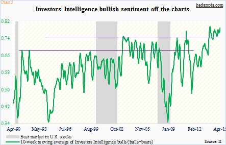
The Q ratio may very well be screaming stretched valuations, but that has not stopped investor sentiment from persistently remaining giddy. In the Investors Intelligence’s weekly survey, bears were 13.9 percent last week, which is the lowest in nearly 40 years. In Chart 5, a 10-week moving average is calculated by dividing bulls by (bulls+bears). The green line has managed to persistently stay at an elevated level – perhaps a reflection of the fact that there has not been a 10-percent-plus correction on the S&P 500 for three years (it came close last September-October).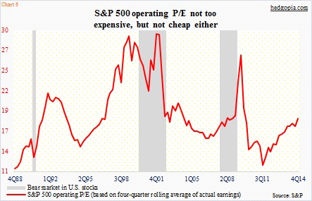
And last but not the least, here is a look at operating P/E on the S&P 500 (Chart 6). These are actual numbers through 4Q14. Last June, 2015 earnings were expected to come in at $137.52; these estimates have now been cut down to $121.31 (courtesy of S&P). Hence using actual numbers, the ratio is not cheap, but not insanely expensive either. Here is the thing. Should investor sentiment bubble up to the late-90s level, there is plenty of runway still left. This also applies to Charts 1, 2, and 4. Is that why bullish sentiment has persistently stayed as elevated as it is?
Maybe, but who knows? What we do know is this. The longer such sentiment persists, the more the pain when it all ends. It is human nature – most of us anyway – not to want to leave the party too early. That will be fine unless one is not left holding the bag.
