
US economic data of late have been coming in strong. Real GDP printed 4.1 percent growth in 2Q18. This was the strongest growth rate in 15 quarters. As of last Friday, the Atlanta Fed’s GDPNow model expects 4.4 percent growth in the current quarter. This is well above not only the post-Great Recession average of 2.3 percent but also the long-term average going all the way back to 2Q47 of 3.2 percent. Thus the question, is the momentum sustainable?
Manufacturing cooled down in July. The ISM manufacturing index dropped 2.1 points month-over-month last month to 58.1. February’s 60.8 was the highest since May 2004. So activity is softening from a very elevated level, and could go down a lot in a worse-case scenario.
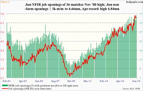
Non-farm job openings for June were published Tuesday. They inched up 3,000 m/m to 6.66 million. April’s 6.84 million was the highest ever. The JOLTS data is in agreement with NFIB job openings. The latter in June rose three points m/m to 36, which matched the all-time high of November 2000.
It is just one month, but at this point in the cycle even the slight softening in the red line in Chart 1 cannot be brushed off as if it was nothing. Too soon to say it is a chink in the jobs armor, but June also saw softening in another JOLTS metric.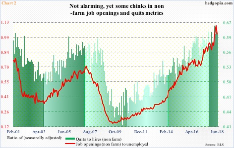
One of the signs of a healthy job market is employees’ willingness or ability to quit. These are voluntary separations initiated by employees, hence reflect conviction that they would not have a problem finding another. In May, there were 3.48 million quits. This declined to 3.4 million in June. Not a big deal, but still a drop is a drop.
In Chart 2, there are two ratios – quits to hires and job openings to unemployed. Hires, too, peaked in May, at 5.75 million, with June at 5.65 million. The quits-to-hires ratio was 0.6 in June, having peaked at 0.617 in March. Ideally, a rising ratio is good. Similarly, the ratio of job openings to unemployed came in at 1.01 in June, down from a high of 1.1 in the prior month. Once again, a rising ratio reflects underlying strength.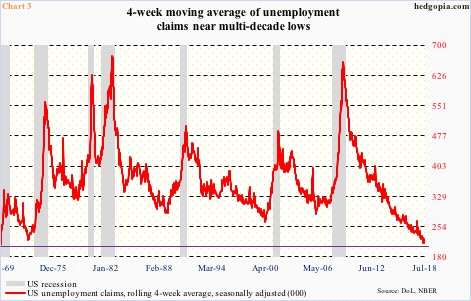
The point to remember in all this is that the US economy is not like a speedboat, rather a tanker. Data does not go from strong to poor overnight. It takes time. Inflection points are always tricky, as things always look great at the top. Might the economy be at such a point right now? If it is, then we are yet to see it in unemployment claims.
Last week, seasonally adjusted initial claims were 218,000. Two weeks before that, they dropped to 208,000, which was the lowest since 202,000 in December 1969. Incidentally, the unemployment rate in July was 3.9 percent; May’s 3.8 percent was the lowest since December 1969. That is how good the jobs picture is right now, which once again raises the question of sustainability.
Chart 3 uses a four-week average of claims, which are near multi-decade lows. At least going back five decades, covering seven recessions, it takes time for the economy to begin to contract after the red line puts in a bottom.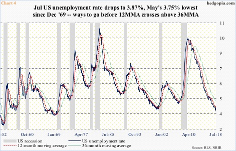
There is a similar message coming out of Chart 4. The idea behind the chart comes from Jeffrey Gundlach of DoubleLine Capital. The chart simply uses the unemployment rate along with 12- and 36-month averages. Bad things begin to happen when the unemployment rate crosses over the 12-month average, or the 12-month over the 36-month – not the case currently.
As mentioned earlier, July’s unemployment rate was 3.87 percent, with the 12- and 36-month average at 4.07 percent and 4.55 percent respectively. A crossover will happen. The economy will contract. It is not a question of if but when – just the nature of things. As things stand, because they have held up well, the best signal likely comes from jobs, hence worth our time.
Thanks for reading!
