There is a lot going on in the land of volatility. Readings are extreme. On Monday, VIX, the S&P 500 Volatility Index, surged to the highest since January 2009 (Chart 1), and RVX, the Russell 2000 Volatility Index, to the highest since October 2011 (Chart 2). (Both these charts only go back to October last year.) On both occasions, stocks were in the process of hammering out major bottoms. In 2009, the low was reached in March, while in 2011 this took place in October itself.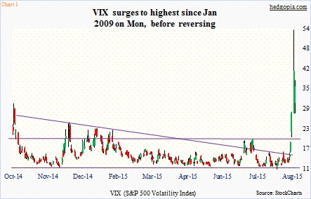
Routinely in the past, a major spike in volatility followed by a reversal has been a great time to buy stocks. After the Monday intra-day high of 53.29, in just a couple of sessions VIX (36.02) gave back 17-plus points. Yet, the S&P 500 Index closed yesterday near the lows of Monday. Similarly, RVX (35.52) is 11-plus points lower, with the Russell 2000 closing Tuesday below the Monday low.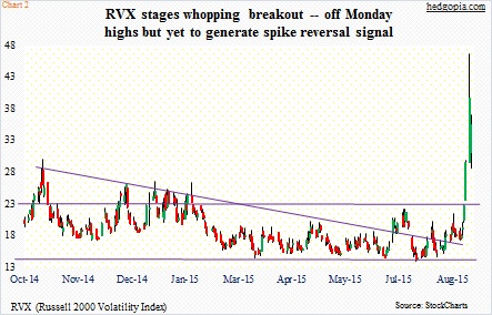
You would think stocks would rally given volatility has come in.
Here is the interesting part in all this. Back in 2009, by the time the S&P 500 bottomed in March, it had lost nearly 58 percent off the October 2007 highs. This time around, from the May 2015 peak to the Monday low, the S&P 500 was down 12.5 percent. Yet VIX managed to surge to the 50s.
What is the message in all this? Some context can help.
Back in September 2008, VIX rose as high as 48.40; August closed at 20.65. Come October, it shot up to 89.53, before ending the month at 59.89. In November, it jumped again to 81.48 before closing at 55.84. VIX stayed elevated for months. Even in March 2009, when stocks bottomed, VIX closed at 44.14. The elevated level and the subsequent unwinding is what provided a big tailwind for stocks once air came out of volatility.
Fast forward to now. Theoretically, if stocks can stabilize here, and volatility begins to come in, equity bulls could not be asking for a better scenario. Alternatively, what if volatility stays elevated, as was the case leading up to the March 2009 bottom in stocks?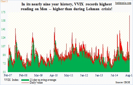
VVIX, the VIX Volatility Index, seems to be betting on the latter scenario.
VVIX is an indicator of the expected volatility of the 30-day forward price of VIX – the so-called VIX of VIX. Take a look at Chart 3. The red line is the daily print. On Monday, it surged to 168.75 – higher than during the Lehman crisis (or the Greek crisis back then or the U.S. debt crisis, for that matter), dropping a tad on Tuesday to 152.42. Markets are betting that volatility will stay elevated going forward.
Arguably, there is a similar message coming out of the ratio of VIX to VXV, the S&P 500 3-Month Volatility Index (Chart 4). The reading on Monday was 1.31 – the highest since 1.43 on October 20, 2008. (Just to drive the point home, the chart uses Monday close; the ratio dropped to 1.22 on Tuesday.) In the past, as the green line comes in – meaning premium comes out of one-month volatility faster than three-month volatility – stocks rise. Once again, stocks would love to have this happen. And once again, some context is in order. If we look at the left of the chart, it is obvious the ascent in the ratio was gradual. The ratio was 1.17 on September 22, 2008, rising to 1.21 on September 29, 1.37 on October 6, 1.38 on October 13, before peaking at 1.43 on October 20. So as is the case with VVIX, VIX:VXV can stay elevated. It acts as a tailwind only when it begins to drop from elevated levels. Tuesday, the ratio dropped, but stocks yawned.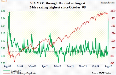
Finally, Chart 5, which, depending on if you are a bull or a bear, can possibly be interpreted either way. In fact, this is probably true with the previous four charts as well.
The green line in Chart 5 is a ratio between RVX and VIX. The former relates to small-caps and the latter to large-caps. This week, the ratio made history. On both Monday and Tuesday, it came in below parity – 0.97 and 0.99, respectively. Currently, large-caps are more volatile than small-caps. In other words, small-caps have become safety havens. Relatively, of course. In the first two trading sessions this week, the S&P 500 is down 5.2 percent, and the Russell 2000 down 4.6 percent.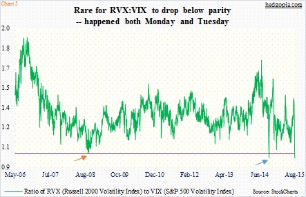
RVX only goes back to 2006, so there is not a whole lot of data to go back and test this hypothesis. Nonetheless, the only other time the ratio fell below parity was in the middle of October last year (blue arrow) – the day U.S. stocks bottomed. The S&P 500 Index nearly lost 10 percent during that September-October sell-off. We know what followed after that bottom. Stocks surged 17 percent in the next seven months. This is the optimistic twist.
Here is the pessimistic one. Once again, let us go back to 2008/09. As early as October 10, 2008, the ratio dropped to 1.01 (orange arrow) and again to 1.02 on the 17th, followed by a lot of back-and-forth action. Stocks were in the midst of a rout back then. The S&P 500 Index made a low of 839.80 in October, and proceeded to make a low of 741.02 in November before trying to stabilize; it only bottomed in March 2009 at 666.79. The lesson in all this? In the best-case scenario for stocks, the ratio should promptly begin to rise. The longer it lingers on – searching for direction – its efficacy as a signal weakens.
Equity bulls naturally would like an outcome what followed the blue arrow in Chart 5, but VVIX increasingly seems to be leaning toward the orange arrow – meaning more volatility ahead, near-term notwithstanding.
Thanks for reading!

