
Peak optimism?
We are increasingly beginning to hear commentators/observers use that phrase in media interviews, articles as well as on social media. Among other things, Charts 1 and 2 are probably to blame.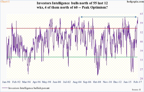
In the latest week, Investors Intelligence bulls stood at 62.7, up nine-tenths of a point week-over-week. It was the highest reading since 62.9 in December 2004.
It is not often bulls cross 60 percent, let alone stay there. Going back to January 1990 (out of 1,413 weeks), there have only been 33 instances in which that milestone was reached. Four of those occurred in the past six weeks (Chart 1). Similarly, bulls have been over 55 in the last 12 weeks straight.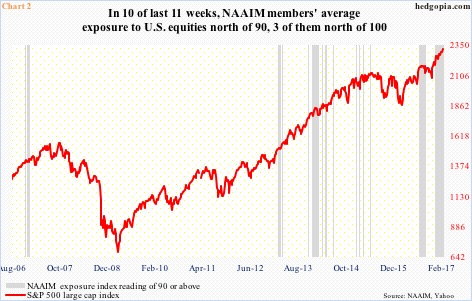
Chart 2 is in a similar uncharted territory.
The National Association of Active Investment Managers conducts a weekly survey of its members to find out their average exposure to U.S. equities. It is rare for the NAAIM exposure index to reach 100 or higher. Beginning July 2006, there have only been seven such instances, three of which occurred last December.
Chart 2 plots the S&P 500 large cap index with the NAAIM reading of 90 or above. In the past 11 weeks, only once did the index drop below 90 (89.29 on January 11), the rest were all over 90, and, as noted above, three above 100. The grey bar on the right side of the chart is a reflection of the prevailing ebullient mood.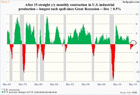
The question is, what is causing this? Better yet, is this accompanied by better fundamentals?
President Trump’s promises to roll back regulations, cut taxes, and increase infrastructure spending have revived growth hopes. As relates to if actual data has improved, the evidence is mixed at best.
Take U.S. industrial production, which peaked in November 2014 at 106.7, before coming under sustained pressure. It then fell for 15 consecutive months year-over-year to 103.7 last November. December broke that downward trend, up 0.5 percent y/y.
Along the same lines, capacity utilization peaked in November 2014 at 78.9 percent. Through last November, utilization fell y/y for 21 straight months. December inched up 0.1 percent to 75.5 percent (not shown here).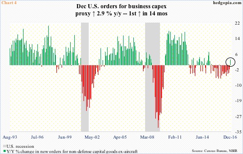
A similar trend was evident in orders for non-defense capital goods ex-aircraft – proxy for business capital expenditures. These orders peaked in September 2014 at a seasonally adjusted annual rate of $70.7 billion, then dropping to $62.2 billion by May last year. Last December, orders rose 2.9 percent y/y to $64.6 billion. This was the first y/y increase in 14 months. In fact, in the last 24 months, there have only been two y/y increases (Chart 4).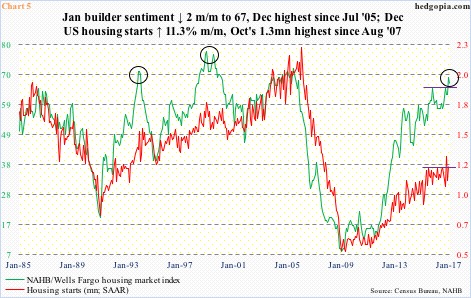
Last but not the least for our purposes here, housing starts last October broke out of a year-and-a-half sideways move to 1.32 million units (SAAR). Concurrently, builder sentiment, represented by the NAHB housing market index, surged last December to 69 – the highest since July 2005.
Peak optimism?
Too soon to say, but the December high is clearly at the upper end of a multi-year range. In the same fashion, housing starts are nowhere near the bubble highs of 2005/2006, but have more than doubled from the April 2009 low.
The point in all this is that both industrial production and orders for non-defense capital goods ex-aircraft reversed a downward trend in December, which came after a big decline from the peak. This much we know. If growth wheels are in motion, then not all the tires are of the same size.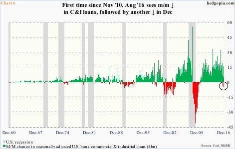
Take banks’ commercial & industrial loans. These loans peaked at $1.6 trillion back in October 2008 and bottomed at $1.2 trillion two years later. By last December, they had jumped to $2.1 trillion, down $5 billion m/m. Since November 2010, this was the second only m/m decrease. The other one was last August, when loans dropped by $4.2 billion – two m/m declines in a space of five months.
This may or may not just be a blip. The two red bars in Chart 6 have shown up after a sea of green. At some point, things decelerate. Just the nature of things. Speaking of which the U.S. economy is just four months away from completing eight years of recovery.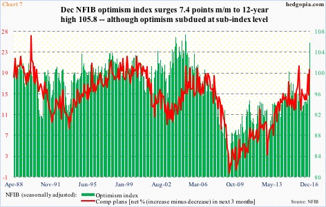
Also pertinent here is the NFIB optimism index, which surged 10.9 points in November and December to 105.8 – a 12-year high. This was the largest two-month jump in the series’ history (data goes back to January 1986).
Here is the rub. If the outcome of the U.S. presidential election resulted in this surge in small-business optimism, this is not yet reflected where it would matter most. Their comp plans, for instance, rose a point in those two months, to 20, which was still below 21 in December 2015. Clearly, they are optimistic, but are watching how things progress.
Equity traders/investors, on the other hand, have reacted already, with the S&P 500 large cap index up 8.3 percent post-election. If data come in as expected, there is the risk of ‘buy the rumor, sell the news’. If reality comes up short of expectations, then we know it will not end well.
Both Charts 1 and 2 are evidence that the balance is tilted toward optimism a little way too much – always an opportune time to take the caution hat out. Peak optimism or not!
Thanks for reading!
