
Is the U.S. economy strong, weak or just about right? Better yet, is it getting stronger, weaker or going sideways? The truth is, pessimists and optimists both can selectively pick and choose to support their own bias.
That said, data of late have been coming in better than expected.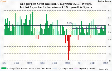
Take real GDP.
The economy grew three percent in 3Q17. This followed 3.1-percent expansion in 2Q17, which was the highest growth rate in nine quarters. This was also the first time in three years that the economy expanded with at least a three handle in two successive quarters (Chart 1).
As a matter of fact, growth in the last couple of quarters is pretty much on par with the long-term average of 3.2 percent going all the way back to 2Q47. Numbers have improved since bottoming at 0.5 percent in 4Q15.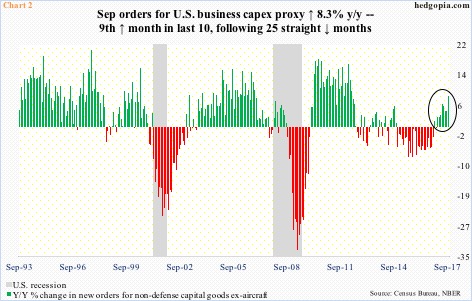
Ditto with orders for non-defense capital goods ex-aircraft – proxy for business capital expenditures.
In September, orders shot up 8.3 percent year-over-year to a seasonally adjusted annual rate of $66.3 billion. This was the highest growth rate since growing 9.6 percent in April 2012 (Chart 2).
Orders have now grown in nine out of 10 months, having contracted in the prior 25.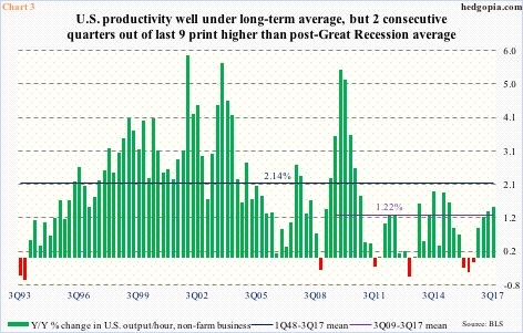
Non-farm productivity has improved as well.
In 3Q17, output per hour increased 1.47 percent y/y – the highest growth rate since 2Q15 when it rose 1.61 percent (Chart 3).
The gradual improvement in productivity the past four quarters follows three consecutive quarterly declines.
Here is the rub in all this.
Productivity remains way suppressed historically. Post-Great Recession, it has averaged merely 1.22 percent, substantially under the 1Q48-3Q17 average of 2.14 percent.
This obviously impacts real GDP. In the current cycle, growth has only averaged 2.2 percent, compared to the long-term average of 3.2 percent (Chart 1).
Or take business capX, for that matter. The 8.3-percent y/y growth in Chart 2 looks magnificent, but that was mainly because orders were suppressed a year ago. After peaking at $70.3 billion in September 2014, orders dropped all the way to $59.9 billion in May last year, before gradually moving higher. Month-over-month, September orders grew 1.7 percent.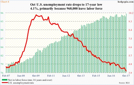
This dichotomy is also evident in employment data.
Yes, the unemployment rate is low – dropped to a 17-year low 4.1 percent in October – but more Americans are also leaving the labor force. In October, the ‘not in labor force’ category swelled by 968,000 to 95.4 million – an all-time high (Chart 4).
October also saw private-sector average hourly earnings contract by a penny m/m to $26.53, rising 2.4 percent y/y. The last time wages grew y/y with a three handle was in April 2009, when Great Recession was on its last legs.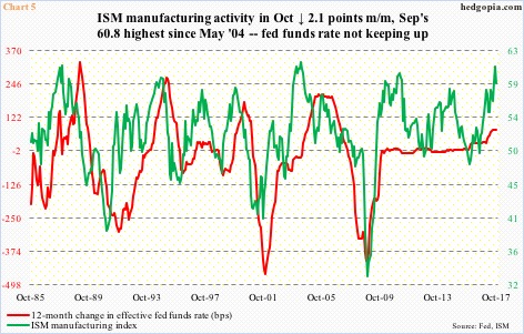
With this as a backdrop, a ‘what if’ is probably apropos. What if the economy decelerates from here?
Indeed, the recovery is in its ninth year. A wear and tear at this point should not come as a surprise. From a business cycle point of view, this is absolutely normal. What is not normal is how the Fed has treated this recovery.
Unlike past recoveries, the fed funds rate has failed to follow growth higher. The monetary quiver has not been filled with arrows.
In October, the ISM manufacturing index dropped 2.1 points m/m, with September’s 60.8 the highest since May 2004. Several times in the past, manufacturing activity decelerated from similar levels. In due course, this has led the Fed to lower rates (Chart 5). No such luxury this time around. The fed funds rate is still very accommodative 1.15 percent.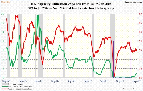
Chart 6 portrays a similar wasted opportunity.
U.S. capacity utilization expanded from 66.7 percent in June 2009 to 79.2 percent in November 2014. Throughout this, the fed funds rate was left floored at zero to 25 basis points. This is not normal. In the past, as the red line in Chart 6 moves up, the green line follows.
This time around, utilization peaked three years ago, even as the Fed began raising rates in December 2015. The fed funds rate has since gone up by 100 basis points, with a probable hike in December. In the past, rates by now would have at least stopped going up.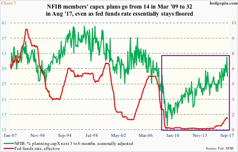
Chart 7 highlights a similar divergence.
In it, National Federation of Independent Business members’ capX plans have been pitted with the fed funds rate. The former ran from 14 in March 2009 to 32 in August this year.
The recent peak in the green line is lower than past peaks – reflective of the prevailing subdued capX scene. Nonetheless, its rise was met by a sideways fed funds rate, which began inching higher only two years ago.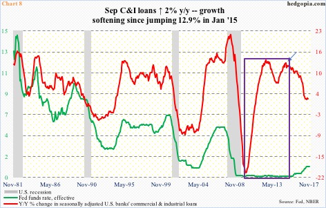
The risk behind the Fed’s failure to build cushion is, once again, ‘what if’?
What if data begin to decelerate from here?
In fact, quite a few already are.
Banks’ commercial and industrial loans were up $11.8 billion m/m in September to $2.13 trillion (SAAR) – a new record. They have been growing y/y since April 2011. Momentum is slowing, though.
September only grew two percent y/y. Growth has been decelerating since January 2015 (arrow in Chart 8).
Once again, in the past, this would have led the Fed to ease. No such luxury this time around. Instead, the opposite is happening.
Hence the urge to ask ‘what if’? What if data decelerate enough that the Fed realizes it is time to ease but has no tools for it? In this scenario, it will be forced to do QE – again – in one form or another. Just a matter of time.
Thanks for reading!
