
Monday marked a history of sorts.
All four major equity indices – the S&P 500 large cap index, Dow Industrials, Nasdaq composite and the Russell 2000 small cap index – broke out to fresh new highs. The last time this took place was late 1999, which brings back memories – good and bad. Good because stocks did not top out until March of 2000, bad because this preceded a nasty bear market.
Come Tuesday, the four indices rose to yet another high.
So where to from here – at least near term?
On a daily chart, they are extended – way extended. But not so on a weekly chart. On the latter, there is room to grind higher still.
Importantly, for a breakout session, volume was anemic on Monday. Particularly so on the S&P 500 and the Nasdaq composite as they broke out to fresh highs – past prior peaks of August 15 and September 22, respectively. The Dow Industrials and the Russell 2000 had already broken out; Monday’s session was the latest in a streak of new highs of late.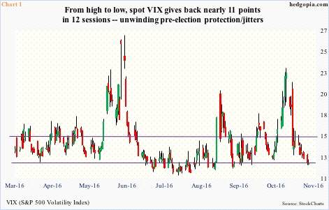
The optimism reflected in stocks – particularly post-Trump victory – is reflected in spot VIX (12.41). Once again, it is at the low end of a multi-year range (Chart 1). From high to low – from November 4 through Monday’s low – it gave back nearly 11 points in 12 sessions, also breaking a slightly rising trend line from August 5 this year.
That said, it is yet to dip below 12 (last time this took place was September 22 this year), let alone 11. The daily chart is too oversold, but weekly momentum indicators in the right circumstances can continue to push lower.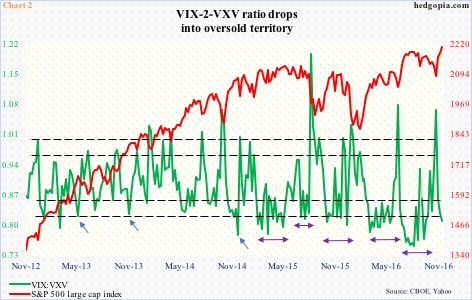
A similar blurry message is coming from the VIX-to-VXV ratio. It just dipped into oversold territory, but is yet to turn up and out of the oversold zone.
In the past, there have been times in which VIX:VXV snapped right back up to unwind oversold conditions (blue arrows in Chart 2). Other times, it gets oversold, and then just stays there – early February to mid-May last year, mid-July to early August last year, mid-October to end-November last year, mid-March to end-May this year, late June to mid-October this year (denoted by by-directional arrows).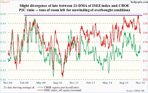
This is probably why put-to-call ratios act confused.
Chart 3 plots the 21-day moving average of the CBOE equity put-to-call ratio and the ISEE index, all equity. The latter is a call-to-put ratio and hence inverted in the chart. The ISEE index is also different from the CBOE P2C ratio in that it only includes opening long customer transactions, and excludes market maker and firm trades.
For the most part, the red and green lines in Chart 3 move in sync, but diverge sometimes. One such occasion was early this month when the green line peaked at .692 on the 8th, before heading lower. The S&P 500 bottomed on the 4th. The red line, however, continued to head higher, peaking at 151.9 on the 17th. In the past several sessions, they have moved in tandem – up in this case. For stocks to continue to do well, the two lines need to be moving lower in the chart.
Historically speaking, both the red and green lines in Chart 3 remain elevated. If equity bulls have their way, they would like these ratios to continue to unwind, which, should it come to pass, should benefit stocks.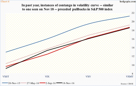
If only it was this simple. If the signal coming from the volatility curve has its way, stocks begin to drop any time.
The VXST (nine days)-VIX (30 days)-VXV (90 days)-VXMT (six months) curve is currently in contango. In the past year, there were three other instances of steep contango – in November last year, and May and September this year – and they each preceded pullbacks in the S&P 500.
In fact, VXST (10.20) last Friday dropped below nine back-to-back, which is a record. On July 3, 2014, it fell below nine to 8.44, and that was it. That said, it does have a short history – only goes back to January 2011. But the sub-nine reading does show an absolute lack of fear near term. When this gets unwound, the curve then transitions to backwardation, which was the case on November 4, when stocks bottomed.
As things stand, amidst all these mixed messages, in the very near term, Chart 4 is probably the one to listen to.
Thanks for reading!
