
- ’15 growth in revenue/earnings expected to decelerate for most S&P 500 sectors
- Signal from options market points to probable pressure ahead for equities
- S&P 500 looks set to at least test if recent breakout was genuine
At first glance, U.S. equity indices could not be looking any better. Most of the major ones recently had a breakout. Had a marvelous February, with the S&P 500 large cap index up 5.5 percent in the month, the Nasdaq composite up 7.1 percent, the Dow Industrials up 5.6 percent, the Russell 2000 small cap index up 5.8 percent, and so on. That is in a month we are talking about!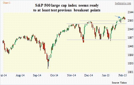
The S&P 500, in particular, badly needed a good February. On a monthly chart, December and January had an ominous look to it. But February has essentially negated that. Elsewhere, the Nasdaq continues to be in the thick of action. The momentum crowd is chasing it more than the S&P 500 or the Dow. AAPL continues to exert an outsized influence particularly on the Nasdaq 100. By the 24th, when it began to retreat, the stock was up north of 14 percent for the month. It has somewhat of a parabolic look to its chart, and looks ready to retreat.
Nonetheless, you dig a little deeper, and one can notice a crack here a crack there. Not everything is moving in sync. Transports are struggling, still trading below the late-November 2014 high. This has the potential to be a big tell particularly given the drop in the price of crude oil. Ditto with financials, trading lower than the late-December high.
All in all, it just does not feel like the breakouts have been able to draw in new money. This being the first week of March, if things hold up, it is possible equities attract some mutual-fund money. Apart from that, the issue continues to be the new source of funds. Margin debt shrank again in January. Needlessly to say, it has been a reliable tailwind for equities. It is now 4.5 percent off its February 2014 highs.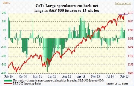
When a breakout is not able to excite particularly those on the sidelines, sooner or later that turns into a false signal. The Russell 2000 had a major break out of a one-year range two weeks ago, but has been unable to build on it. The price does currently remain above the breakout point. To be fair to small-cap bulls, since the breakout they have defended that level several times. Nonetheless, action looks very tentative. And non-commercials continue to stay net short. Not that they are always right, but they have maintained net shorts in Russell 2000 mini-index futures in the 30k range for the past five weeks (chart here).
Speaking of non-commercials, here is something interesting. In the latest reporting period, these large speculators cut short their net longs in e-mini S&P 500 futures by 74 percent – from 93k to 24.2k (Chart 2). This, only a couple of days after the index broke out (blue arrow in Chart 1). Yet another example of recent breakouts’ failure to ignite more buying.
For now, the S&P 500 seems headed for at least 2080, or thereabouts. That was the area it broke out of two weeks ago, and where its 20DMA lies. Bulls are not going to give up that area that easy. They are not supposed to. If they cannot defend that at the first test, then we know their ranks are getting thinner. We will see.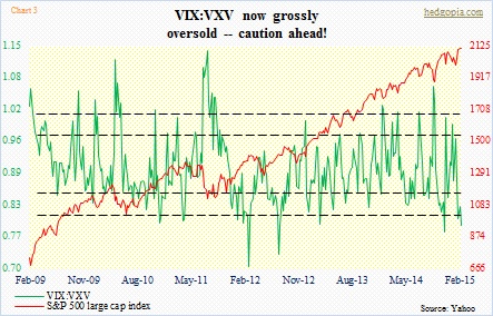
What is not working in favor of the bulls at the moment is what is transpiring in the world of VIX, which measures implied volatility on S&P 500 options one month out. Its cousin, VXV, does the same but goes out three months. As of Friday, the ratio between the two stood at 0.79, which in the past has consistently been a signal to get cautious on equities (Chart 3). A similar message is coming from the Hedgopia Risk Reward Index, which seems to have started its journey down from the risk zone (Chart 4).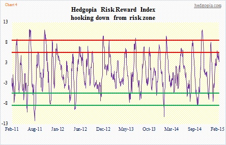
Not that it has mattered so far to the Teflon market, but the earnings picture has continued to unfold in a manner that in normal times would probably not be friendly to the bull thesis. Chart 5 compares 2014’s actual earnings for S&P 500 companies with sell-side consensus estimates for 2015. First off, operating earnings estimates for 2015 have collapsed from as high as $137.52 at the end of June last year to $118.32 (courtesy of S&P). It is typical for earnings estimates to start out high as the year begins and then get cut as the year progresses. This year, because of what is going on in the energy complex, estimates are slashed left and right even though we are only two months into the year.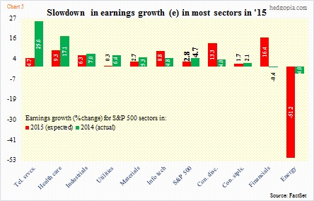
Secondly, a closer look at Chart 5 reveals that it is not just energy. There are other culprits. Of the 10 sectors, only three are expected to have higher growth rates than in 2014 – information technology, consumer discretionary, and financials. The latter is expected to have a lower revenue growth rate this year than in 2014 (Chart 6), yet earnings are expected to surge. Probably because the Fed is expected to begin to hike rates this year, which can – not will – result in wider spreads. In other words, margins are expected to expand. Consumer discretionary will benefit if consumers decide to do away with all of their savings from lower gas price. That is the hope.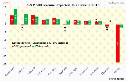
The biggest tale of all in all this is probably Chart 6, with S&P 500 revenue expected to drop in 2015! The chart also shows that only three sectors – information technology, consumer discretionary, and consumer staples – are expected to have a higher growth rate than in 2014. This directly relates to Chart 7. The correlation between U.S. nominal GDP and S&P 500 sales is a near-perfect 0.95. Yet we have a situation in which consensus GDP (real) forecast for the year lies in the neighborhood of three percent.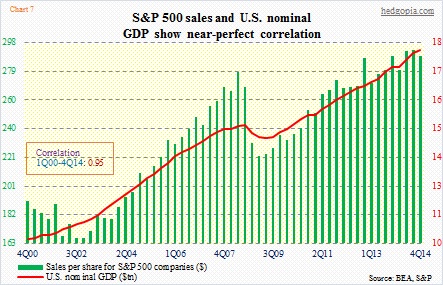
One of the two is lying. Either GDP is set to be substantially revised lower, or the sell-side has been too enthusiastic in cutting estimates early on and will revise them higher as the year progresses.
Stocks are betting on the latter outcome. Time will tell.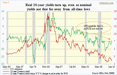
We do know this.
Despite what we see in the nominal world, things are a little different in the real world. In the real-interest rate world, that is. Things are tighter than they seem (Chart 8). The chart covers eight recessions. In almost all of these, real interest rates spiked before recession, and then retreated as the economy contracted. In the current cycle, real rates bottomed at a minus 0.95 percent in September 2011 and have trended higher since. The most recent spike began in November last year. Recall that nominal rates have only been heading lower. So has inflation. In the chart, the PCE price index has been used. Although the latest data point (January) uses the CPI, as PCE is not out yet (will be out later this morning). Here is the confusing part. In each of these instances, recession has also preceded firmer nominal yields. Which is not what we have right now. Which is good. Although given that nominal rates are near all-time lows and until recently were used as a QE tool by the Fed, one wonders if they can be used as a signal. Still, it is definitely something to keep on the back of one’s mind.
This is more of an intermediate-term worry, if at all. Near-term, pressure is building for equities to head lower.
