
If early this year the 10-year T-yield vouched for the strength of the US economy as it broke out of multi-year/decade resistance, what is it trying to tell us now that it seems to have hit the wall and is under pressure?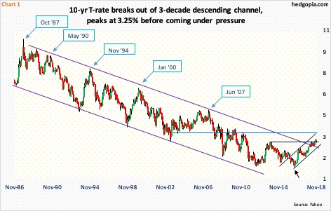
In the bond universe, there was a lot of excitement among bond bears when in April this year the 10-year Treasury rate poked its head out of a three-decade-old descending channel (Chart 1). To many, the breakout supposedly marked the end of a multi-decade bull market in sovereign bonds. The channel in question goes back to the late-’80s. The 10-year yield actually began dropping from a high of 15.84 percent in September 1981, bottoming at 1.34 percent in July 2016.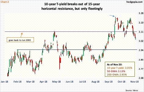
By October 5 (this year), the 10-year had risen to 3.25 percent (arrow in Chart 2), which was the highest since May 2011. On November 9, that high was tested – unsuccessfully. The rally – at least for now – seems to have hit the wall. The 10-year has come a long way. As recently as August this year, these notes yielded 2.81 percent and 2.03 percent in September last year.
On its way to October’s seven-plus-year high, the 10-year (3.05 percent) took out 15-year resistance at 3.11 percent. Staying above that level proved difficult. Three percent – another important level – is not that far off. Around 2.9 percent lies a rising trend line from July 2016 (black arrow in Chart 1). Right around this support lies the 200-day moving average (2.95 percent) and multi-month horizontal support (Chart 2).
If overbought monthly indicators begin to unwind, the 10-year has plenty of room to continue lower. This is a medium- to longer-term risk for the bears.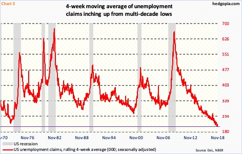
The bigger question is, is the bond market trying to tell us something about the state of the economy or where it might be headed? When the 10-year rate broke out early this year, it was widely accepted as confirmation of the strength of the economy. Using that logic, the recent drop in yields is not sending good vibes.
Current data sets are still strong, with signs of deceleration. Real GDP expanded 4.2 percent in 2Q18 and 3.5 percent in 3Q. As of Tuesday, the Atlanta Fed’s GDPNow model was forecasting 2.5-percent growth in 4Q. The ISM manufacturing index in October fell 2.1 points month-over-month to 57.7; August’s 61.3 was the highest since May 2004. After nearly two years of year-over-year contraction, industrial production went positive in March 2017. This September, production rose at a 5.6-percent pace – an eight-year high – with October softening a tad to growth of 4.1 percent. A decelerating trend is evident in all these data sets.
Several metrics are currently so strong one wonders what unwinding will look like once – not if – it begins. Take unemployment claims, which mid-September dropped to 202,000, matching the low of December 1969. In 1968-’69, claims persistently remained sub-200,000. This time around, since the mid-September low, claims have risen a tad, to 216,000. They remain very low historically.
Chart 3 uses a four-week rolling average. On that basis, the mid-September low of 206,000 was the lowest since – once again – December 1969. The momentum cannot continue forever. Not when the post-Great Recession recovery/expansion is in its 10th year. Historically, once the red line in the chart turns up and sustains, recession follows sooner or later. In the latest week, the four-week average ticked up to 215,250.
This metric is worth paying attention to as several other data points have decidedly stalled.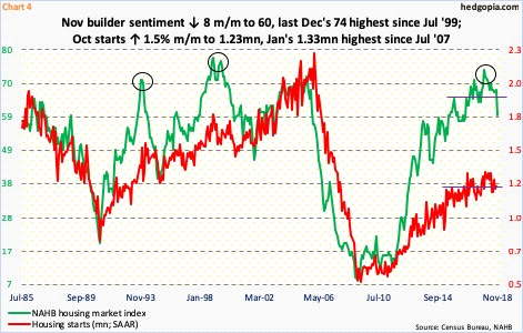
As important a sector as it is, housing is hurting. Sales of both new and existing homes peaked November last year at a seasonally adjusted annual rate of 712,000 and 5.72 million units respectively. These were the highest since October 2007 and February 2007, in that order. In September, sales came in at 553,000 and 5.15 million.
Housing starts show the same trend. In October, starts were 1.23 million units (SAAR). January’s 1.33 million was the highest since July 2007. As Chart 4 shows, starts have essentially gone sideways the past three years. In the meantime, builder sentiment has witnessed a mini-collapse of sorts.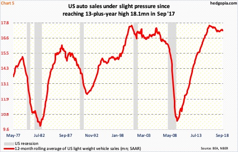
Another bulwark of the economy – auto sales – is showing early signs of cracks as well.
Sales of light-weight vehicles were 17.4 million in September, having peaked at 18.1 million in September last year. Monthly data tend to be volatile. This is smoothed out in Chart 5 by using a 12-month rolling average, which shows sales peaked as early as February 2016 at 17.6 million. Sales on that basis were 17.2 million in September – still very healthy but they remain elevated. The risk is to the downside.
Data after data show that the economy is in deceleration. The only question is, how bad it is going to get? No one has the answer. Given the maturity of the cycle, it is prudent to at least stay open to the possibility of meaningful deceleration. Long bonds are worth watching in this regard. More often than not, they lead.
Thanks for reading!
