
Stocks have rallied big on hopes of even easier monetary policy. In the very near term, bulls carry the momentum ball. Medium- to long-term, a daunting task likely awaits them. The Fed’s toolkit is inadequate. Plus, its stimulative measures may not yield the desired results as they would in a normal economic cycle.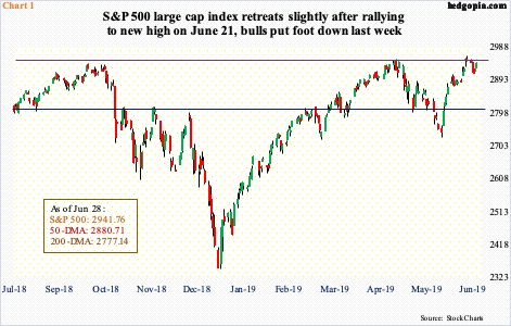
Equity bulls put their foot down in the middle of last week. After peaking on June 21 at the intraday high of 2964.15, the S&P 500 large cap index in the next three sessions gave back 1.7 percent. Bids then showed up at the 10-day moving average. The low was set three sessions ago last Wednesday, with the index rallying one percent since.
Similar dynamics are in play at other indices. The Nasdaq 100 index six sessions ago came within one percent of surpassing its record high of 7851.97 from April 25, before coming under pressure. Similar to the S&P 500, bulls defended the 10-day the past four sessions. At Friday’s close, the index sits 2.4 percent from a new high.
From this perspective, the Russell 2000 small cap index is way behind. It closed Friday 11.2 percent from its record high of 1742.09 from last August. After failing to take out 1600-plus early May, the index struggled. Later last week, small-cap bulls stepped up to the plate, with the index rallying 3.2 percent Thursday and Friday, past the 50- and 200-day. Near term, 1570s is the one to watch. The index retreated from 1570.74 seven sessions ago. Right around there also lies a falling trend line from last August. Reclaiming of this level likely opens the door to a test of 1600.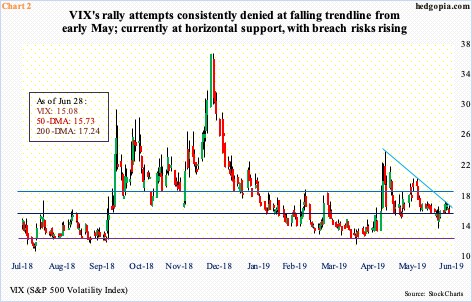
In the very near term, VIX (15.08) is behaving as if it wants to go lower.
For nearly two months now, VIX has managed to stay at a higher plateau, with 14-15 consistently providing support. Breach risks are rising. Last Friday, after lingering around the 50-day for several sessions, it lost the average.
On May 9, VIX spiked to 23.38 intraday before reversing. Since then, rally attempts have consistently been rejected at a trend line drawn thereof, including the last four sessions last week (Chart 2). The resulting descending triangle typically is a continuation pattern in a downtrend.
In the meantime, daily Bollinger bands, currently 3.65, may have a little bit more room to contract. Late April, they contracted to less than 2.50 before VIX began surging. Support at the lower band lies at 14.01 currently. Seven sessions ago, VIX dropped to 13.19 intraday before rallying to end the session at 14.75. As things stand, 13-14 offers decent support.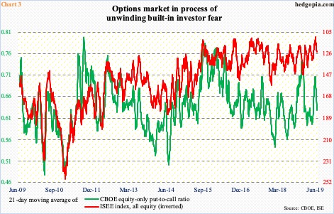
Elsewhere in the options market, the amount of investor fear that accumulated in May is being unwound. The 21-day moving average of the CBOE equity-only put-to-call ratio bottomed at 0.596 on April 30, then rising to 0.706 by June 5. Last Friday, it stood at 0.628. Typically, unwinding can continue until the ratio drops to low-60s/high-50s.
Along the same lines, the 21-day moving average of the ISEE index, all equity, ended last Friday at 123.6, up from the all-time low of 109.8 on June 6. This is a call-to-put ratio, hence inverted (Chart 3). ISEE excludes trades from market makers and brokers/dealers, and only uses opening long trades. In the right circumstances for equity bulls, the red line can continue lower.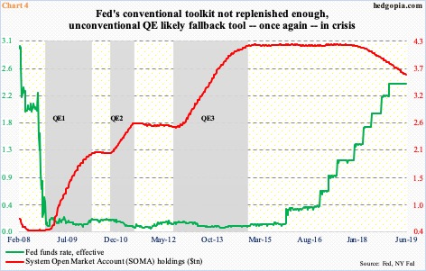
This is near term. Medium- to longer-term, the outlook is blurred, if anything.
The fed funds rate currently stands at a range of 225 to 250 basis points. In the four years through last December, rates went up 225 basis points (Chart 4). Until the latter months of 2018, the FOMC dot plot expected at least a couple more hikes this year. Shortly after the December hike, the Fed softened its message. That was when the S&P 500 between early October and late December declined 20 percent.
In the June meeting, the Fed opened the door for possible easing. Fed funds futures currently expect a 25-basis-point cut later this month, followed by another cut of the same magnitude in September, and maybe another in December. Markets are hoping the Fed launches into aggressive easing mode, and into quantitative easing eventually. Currently, the Fed continues to run down the assets it accumulated during the three iterations of QE post-financial crisis, with System Open Market Account (SOMA) holdings at $3.62 trillion. Stocks did very well during QE and are hoping for an encore.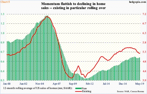
The US economy just completed a decade of recovery/expansion post-Great Recession. There are signs of wear and tear. The key question is, what might a reduction in fed funds do to the economy at this stage in the cycle? The availability of credit is not the issue.
The same is true with QE. The three iterations of QE post-financial crisis have been an eye-opener in that it is no panacea. The Fed’s aggression back then restored life back into the economy, no doubt. But, with the Fed’s balance sheet as elevated as it is, once again, the economy is stagnating at best and weakening at worst.
In recent months, mortgage rates, for instance, followed the long end of the Treasury yield curve lower. The 10-year rate dropped from 3.25 percent last October to two percent last Friday, and the 30-year fixed mortgage rate from 4.94 percent to 3.73 percent. This is yet to provide a boost to home sales.
Chart 5 plots the 12-month moving average of both existing and home sales, with the former clearly rolling over and the latter sideways to weakening. Amidst this, the Fed’s monetary quiver lacks sufficient arrows.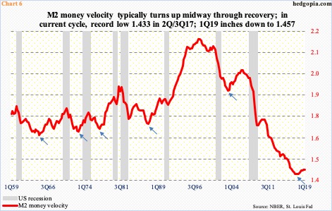
One needs to look no further than the money velocity to find out what is going on in the economy. The velocity of money measures economic activity of a nation. It is the speed at which a dollar moves from one transaction to another and tells us how long people hold onto their money. The higher the number of transactions, the more goods and services are produced.
From the end of Great Recession through 1Q19, nominal GDP increased 46.7 percent to a seasonally adjusted annual rate of $21.1 trillion. M2 money supply (seasonally adjusted) during the period jumped 71.7 percent to $14.5 trillion. Velocity dropped from 1.71 to as low as 1.43 in 2Q/3Q17; 1Q19 was 1.46 (Chart 6). Simplistically, assuming velocity stood at pre-Great Recession level of two, nominal GDP would be north of $28 trillion.
Early on during the current recovery, velocity gathered steam, rising to 1.74 in 3Q10. Then it was all downhill. Going back to 1959 – encompassing eight recessions – velocity has shown a tendency to turn up midway through the recovery. Not this cycle. A sign of the times!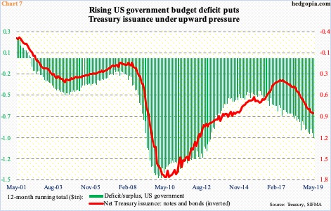
Soaring budget deficit is another example.
The current recovery/expansion is a decade old. This up cycle is not marked by improvement in the government’s finances. The budget deficit is under consistent upward pressure. Back in February 2010, the 12-month running total of the US government’s receipts minus outlays peaked at minus $1.5 trillion. The subsequent improvement ended in January 2016 when the red ink stood at $403.6 billion. In May (this year), this had ballooned to $985.4 billion. Not surprisingly, the issuance of Treasury notes and bonds continues to rise (Chart 7). This at a time when the economy continues to grow. We can imagine how this will fare when the next recession hits.
The Fed is caught between a rock and a hard place. Not only is its toolkit wanting but it is also looking at a situation in which its stimulative measures are less likely to yield the desired results – the way they would in a normal cycle. Post-Great Recession, leverage has only grown (chart here). Hence growing odds that stocks that have rallied on hopes that an even easier monetary policy will take care of all the ills stand to get disappointed in months/quarters to come. Near-term is another matter.
Thanks for reading!
