
The U.S. sovereign bond market has hit the headlines a lot these days. Rates have rallied big since September 2017 lows, but from suppressed levels, and are at crucial stage technically. At least near term, fundamentals do not allow for a meaningful breakout.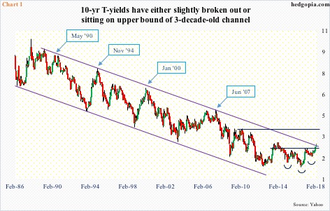
Ten-year Treasury yields (2.87 percent) went from 2.03 percent early September last year to 2.94 percent last Wednesday before retreating slightly. They have remained trapped in a three-decade-old descending channel.
As seen in Chart 1, depending on how we draw the channel, yields have either broken out or are about to. Several times in the past, a kiss of the upper bound accompanied an important turn in the economy, pushing yields lower.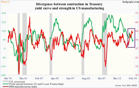
This time around, the U.S. economy – as well as global – is humming along. U.S. real GDP expanded 2.6 percent in 4Q17 (first estimate), coming on the heels of growth of 3.2 percent in 3Q and 3.1 percent in 2Q. As of the 16th, the Atlanta Fed’s GDPNow model was forecasting another 3.2-percent growth in 1Q18.
Manufacturing activity is robust. The ISM manufacturing index in January inched down two-tenths of a point month-over-month to 59.1. Last September’s 60.2 was the highest since June 2004.
Chart 2 plots the manufacturing index against yield spread between 10- and two-year Treasury notes. Perhaps revealingly, the two are not quite moving in tandem, which otherwise is normally the case. Early this year, the spread shrank to as low as 50 basis points.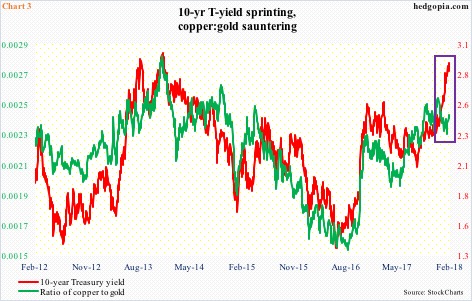
In the past couple of months, the rally in 10-year yields is also not confirmed by the ratio of copper to gold. Copper is a base metal, and is widely used in industrial and commercial applications. One aspect of gold, on the other hand, is its defensive nature.
Simplistically, a rise in the ratio suggests demand for copper is strong – hence strong economic activity – and vice versa. Of late, the green line in the chart is sideways to down, even as the rate for the 10-year has shot up.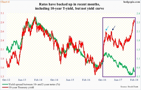
A similar dichotomy can be seen in Chart 4.
As mentioned above, the spread between 10- and two-year yields has not quite followed rates higher. The green line began to diverge post-U.S. presidential election in November 2016. After a sharp rally, the red line got rejected at 2.6 percent (blue arrow), which once again repelled rally attempts in March last year (dark blue arrow). This resistance has now been taken care of. The spread, on the other hand, is going the other direction, coming under pressure since peaking at 134 basis points on December 22, 2016.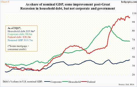
What is the bond market sensing? We are witnessing this behavior amidst the afore-mentioned strength in macro data.
Technically, it is important to point out that 2.6-2.62 percent on the 10-year also represents the neckline of a reverse-head-and-shoulders formation. If the breakout is genuine, technicians would be eyeing 3.9 percent in due course (Chart 1). By that time, yields would have cleanly broken out of the channel. In this scenario, given the leverage in the economy, repercussions will be felt.
Post-Great Recession, the economy recovered, but with it came continued buildup in debt. U.S. corporate debt went from $6.5 trillion in 2Q09 to $8.8 trillion in 3Q17, federal debt from $11.5 trillion to $20.6 trillion, and household debt from $13.2 trillion to $13.8 trillion. The rather flattish household debt is primarily because of mortgage debt which declined from $10.6 trillion to $10 trillion. Consumer credit, on the other hand, went from $2.6 trillion to $3.8 trillion.
Chart 5 calculates the percent share of these debt categories in nominal GDP. What jumps out in particular is the red line, which has gone parabolic. For five years now, government’s debt has been at 100 percent or higher of nominal GDP. The significance of Chart 6 could not be clearer.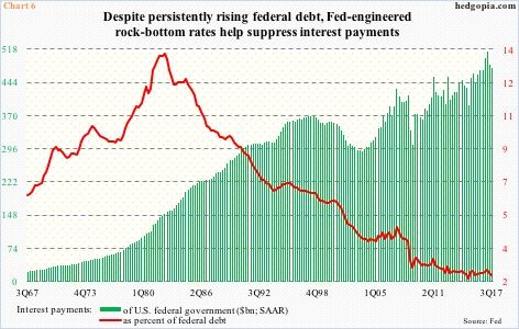
In 3Q17, federal interest payments were $475.3 billion (SAAR), versus $372 billion in 2Q09. This is quite an increase, except this could be a lot worse if not for the Fed. Not only did it leave the fed funds rate near zero for seven years, it also launched three iterations of quantitative easing which put downward pressure on long rates. Even after five 25-basis-point hikes since December 2015, fed funds remains at 1.42 percent. And in July 2016 the 10-year dropped to record low 1.34 percent.
Consequently, interest payments as a share of federal debt comprised 2.35 percent in 3Q17. If this goes up by 100 basis points – not outside the realm of possibility if the current trajectory continues – we are talking $665 billion in interest payments. This is just the federal government.
In and of itself, this has the potential to act as a headwind to the economy, and, by default, rates.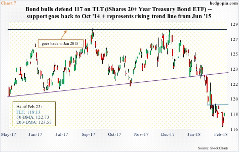
In this scenario, quite a few fixed-income managers may find three percent, or thereabouts, on the 10-year quite attractive. In the right circumstances for bond bulls, a short squeeze is possible. Short interest on TLT (iShares 20+year Treasury bond ETF) is elevated. As are non-commercials’ net shorts in 10-year note futures.
For now, TLT ($118.13) bulls have defended support at $117. This represents horizontal support going back to October 2014 plus a rising trend line from June 2015. At least near term, the likely path of least resistance is up. On the daily chart, the MACD is on the verge of a potentially bullish crossover. On the weekly, last week’s hammer followed a spinning top in the prior week. Short-term resistance lies at $119.25 (Chart 7).
Last week, a hypothetical buy-write on TLT brought the effective cost down to $118.40. The still-falling 20-day lies at $119.42, and can pose resistance. Weekly (March 2) 119.50 calls bring in $0.17. This is not a whole lot, but the covered call will help bring the cost down further to $118.23. If the underlying rallies past the strike, then it gets called away for a profit of $1.27.
Thanks for reading!
