
Arguably, US stocks are giving off some signs of fatigue. The S&P 500 large cap index (2840.35) is still below its late-January high of 2872.87. The Nasdaq 100 index (7395.49) in the week before was rejected at six-month-old channel resistance; it is 1.6 percent from its all-time high. The Russell 2000 small cap index (1673.37) over the last six weeks has been denied at 1700-plus three times. But at the same time, bulls last week defended 2800 on the S&P 500, even as the 50-day was successfully tested on the Nasdaq 100, and the Russell 2000 ended the week right on the 50-day, after losing it earlier.
So let us play a ‘what if’?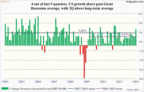
Real GDP grew 4.1 percent in 2Q18. This was the fastest growth rate in 15 quarters – above the long-term average of 3.22 percent going back all the way to 2Q47 and well above the post-Great Recession average of 2.27 percent (Chart 1).
It is only five weeks into the third quarter, but as of last Friday the Atlanta Fed’s GDPNow model forecasts another strong performance in the current quarter, expecting growth of 4.4 percent. Treasury Secretary Steven Mnuchin last week chimed in, “I think we definitely are in a period of four or five years of sustained three percent growth at least.”
The economy is in its 10th year of recovery. The unemployment rate dropped from 10 percent in October 2009 to 3.8 percent this May, which was the lowest since December 1969 (July was 3.9 percent). There is tremendous leverage in the system, and interest rates are not as accommodative as in the past. It is hard to convincingly argue for sustained growth of three percent for another four or five years. But what if the Treasury Secretary is right?
The unemployment rate is sub-four percent, yet 95.6 million Americans are out of the labor force. In June 2009, when the prior recession ended, this stood at 80.9 million. If jobs continue to be plentiful and those that left the labor force gradually start coming back in, the recovery does not have to die of old age.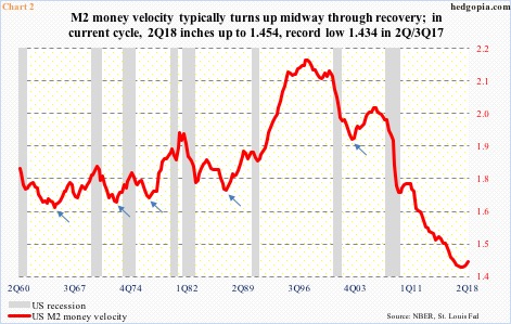
Historically, M2 money velocity tends to turn up midway through economic recovery (arrows in Chart 2). This cycle has been different. Or, has it?
Post-2008 financial crisis, there has been too much intervention from the central bank. Through three iterations of quantitative easing, the Fed grew its balance sheet from under $1 trillion to $4.5 trillion (currently $4.3 trillion). Banks hold $1.8 trillion in excess reserves. So these variables could very well be distorting M2 velocity. When Great Recession ended, the velocity was 1.708. In 2Q18, this came in at 1.454, having bottomed at 1.434 in both 2Q and 3Q last year.
Now what if history repeats itself and the velocity continues higher for several more years? In this scenario, the Treasury Secretary’s aforementioned optimism may not be so pie in the sky. And the current softness seen in housing may not snowball into something nasty in months to come.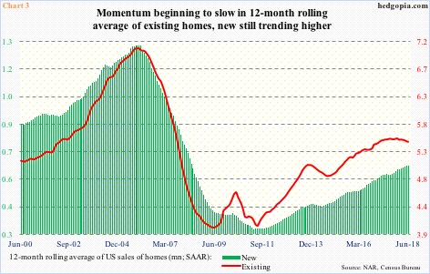
In recent months, sales of both new and existing homes have weakened. They both reached cycle highs last November – new homes at a seasonally adjusted annual rate of 712,000 units and existing at 5.72 million. These were the highest since October and February 2007, respectively. This June, sales were 631,000 and 5.38 million.
Chart 3 presents these sales figures on a 12-month rolling average basis, which shows sales of existing homes are rolling over, while sales of new homes are still holding up. One of the reasons behind weaker sales is persistent strength in the home price. In June, the median price of an existing home was a record $276,900, while a new home went for $302,100 (record high of $343,400 was set last November).
Housing plays a crucial role in the economy. Now what if the current weakness is just a pause on its way to stronger sales and that the strength in price gets trumped by low mortgage rates?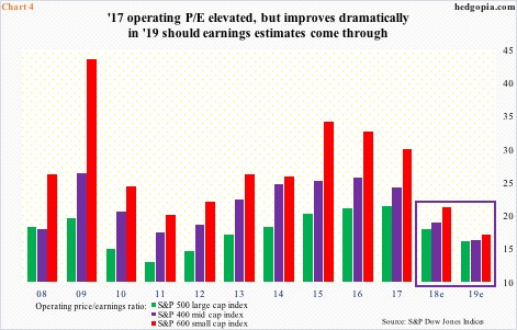
All this argues for a rosy scenario for corporate earnings, which, post-tax cuts, went through the roof.
The Tax Cuts and Jobs Act of 2017 was signed into law on December 22 last year. On December 21, operating earnings estimates for 2018 were $145.31 for S&P 500 (large cap), $97.60 for S&P 400 (mid cap) and $45.41 for S&P 600 (small cap). At the end of July, they respectively were $157.96, $105.15 and $49.69. In each, 2018 estimates are slightly trending down, with recent highs of $158.24 (S&P 500), $106.66 (S&P 400) and $50.66 (S&P 600). Next year, estimates for 500 and 400 companies are $176.40 and $123.06 respectively – both new record – even as estimates of $61.19 for the 600 are slightly off the high of $61.63 at the end of June.
As things stand, S&P 500 companies next year are expected to grow earnings 11.7 percent, S&P 400 17 percent and S&P 600 23.1 percent. This comes on the heels of expected growth of 26.9 percent, 34.6 percent and 59.3 percent this year, in that order. These are unreal – and unsustainable – growth rates. If 2019 estimates come through, the price-to-earnings multiple does not look as egregious as it did at the end of 2017 last year (Chart 4). The kind of growth rate built into 2019 estimates assumes a lot of good things in the economy, which, once again, are difficult to grasp given how mature this recovery is. But, what if? What if things are different this time, as many would like to argue?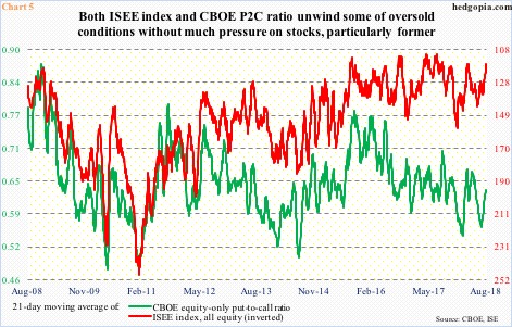
The previous four charts speak of ‘what if’ possibilities of medium- to long-term in nature. The remaining three are more short-term in nature.
Chart 5 highlights the 21-day moving average of the CBOE equity-only put-to-call ratio and the ISEE index, equity only. The latter is a call-to-put ratio, hence inverted. On June 26, the CBOE put-to-call ratio bottomed at 0.56. This was a low reading and reflected built-in optimism among equity bulls. In normal circumstances, as the ratio pushes higher, stocks tend to come under pressure. This time around, stocks continued to nudge higher, even as the ratio rose to 0.631 last Wednesday. In the past, the ratio would have unwound the built-in optimism as it reached high-0.60s to low-0.70s. This time around, with last Friday at 0.624, the ratio is turning lower from the middle. What if it continues to head lower? This is a potential tailwind for stocks. The ISEE index in particular is beginning to rise from a very suppressed level.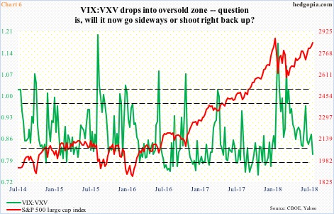
The VIX-to-VXV ratio is another metric that currently raises a ‘what if’ possibility. Last Friday, the ratio read 0.803. VIX measures markets’ expectation of 30-day volatility. VXV does the same but goes out three months. When the ratio is oversold, nearer-term volatility is suppressed. As it begins to rise, VIX rises more than VXV, which, more often than not, accompanies a decline in stocks. This scenario could easily unfold given this is the first time since January the weekly close of the ratio has dropped into oversold territory.
Then there is this. Several times in the past, the ratio got oversold, but instead of snapping right back up it went sideways, and stocks continued higher. Or, the ratio can continue lower into the mid-0.70s.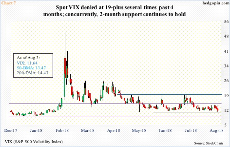
On a related note, VIX of late has given both volatility bulls and bears hope. Over the past three months, 19-plus resisted rally attempts several times, but at the same time for two months now support at 11 has been consistently defended. Concurrently, the daily Bollinger bands have tightened to merely 2.3 points. Contraction of the bands often precedes a sharp move – either way. VIX is already in low double digits. So one would think the path of least resistance is higher. But what if it goes on to test the all-time low of 8.56 of last November – or thereabouts? This is potentially positive for stocks.
On a weekly basis, major indices remain grossly overbought. Even if the aforementioned ‘what if’ scenarios in Charts 5/6/7 pan out, this likely will not be lasting – unless of course market participants sense increasing support from Charts 1/2/3/4. This is not a base case on this blog, but it helps to remain cognizant – just in case.
Thanks for reading!
